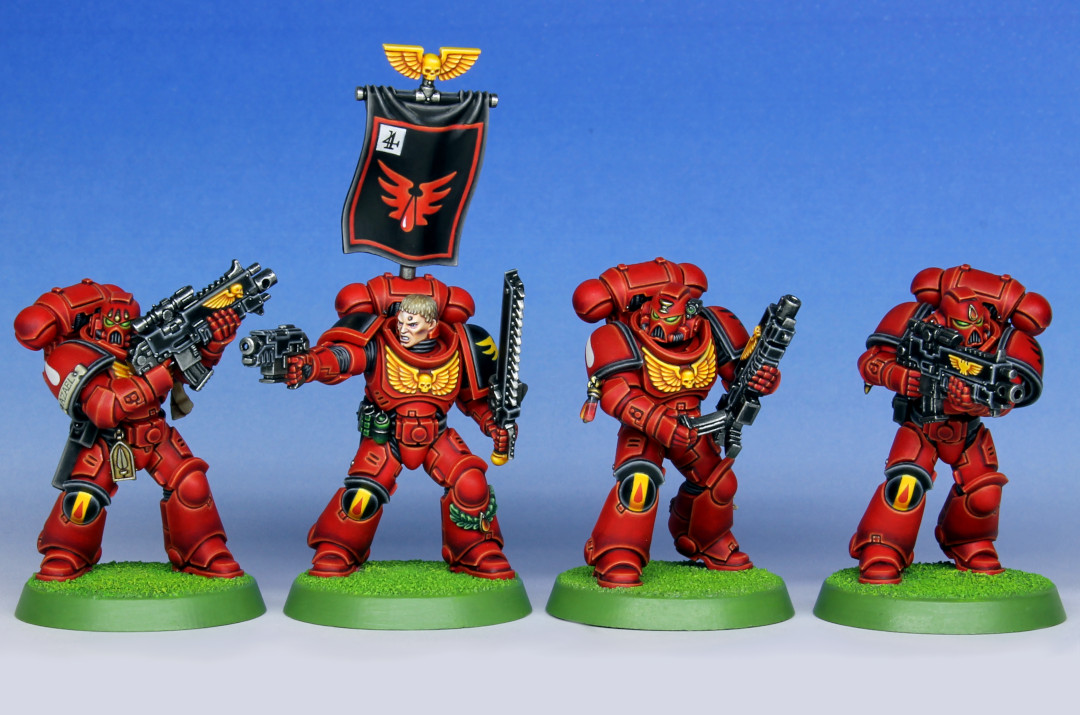
My dabblings in the Warhammer hobby these days seem to be almost entirely driven by nostalgia for the early to mid 90s games of my youth, in an almost certainly doomed attempt to recapture the excitement of that glorious era. In that frame of mind, a couple of years ago I had a go at making a mk 7 Blood Angel in the new primaris scale, but with only limited success. Reflecting on that project I thought that maybe the old armour marks don’t scale that well to the more realistic proportions of today (or it’s beyond my skill to make it work well) and in any case, the old style bolter just looks a bit underwhelming against a primaris size marine. Apparently marines need comically oversized guns to look right!
I still had an itch that I needed to scratch, so I thought it would be interesting to use the current primaris intercessor kit as a base to try to make a Warhammer 40k 2nd edition style Blood Angels tactical squad. I’ve got loads of old space marine bits lying around (in common with most hobbyists I suspect!) so the plan was to use those to try and bring a bit of the old flavour to the new kit.
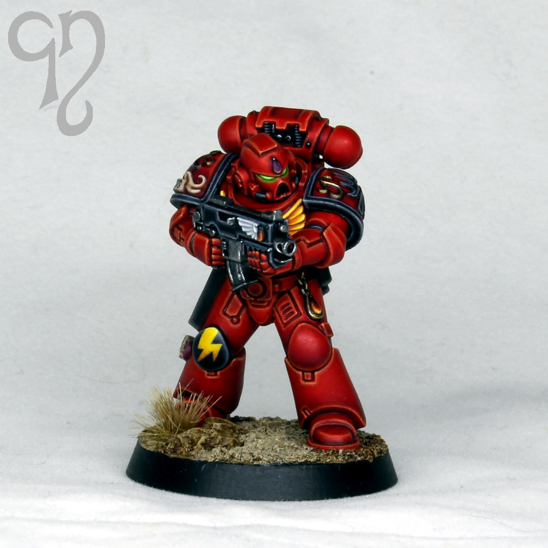
My first test model is on the left in the above image. For this I used the same colour recipe that I outlined in the previous post, and went with the 2nd edition style of a yellow chest eagle and black pauldron rims. The knee pad is my own variant on the classic red blood drop on black background, as I sometimes feel that the red on black doesn’t have enough contrast, so the addition of the yellow stripe is intended to help with this and also serves to echo the chest eagle. Since it was just a test model, I thought I’d also take the opportunity to try adding some battle damage, which is something I normally prefer to avoid. Although it adds a certain air of gritty realism to the mini, I thought it felt a bit out of place for this project, which is all about the bright colours and cartoony look of 2nd edition, complete with goblin green bases of course!
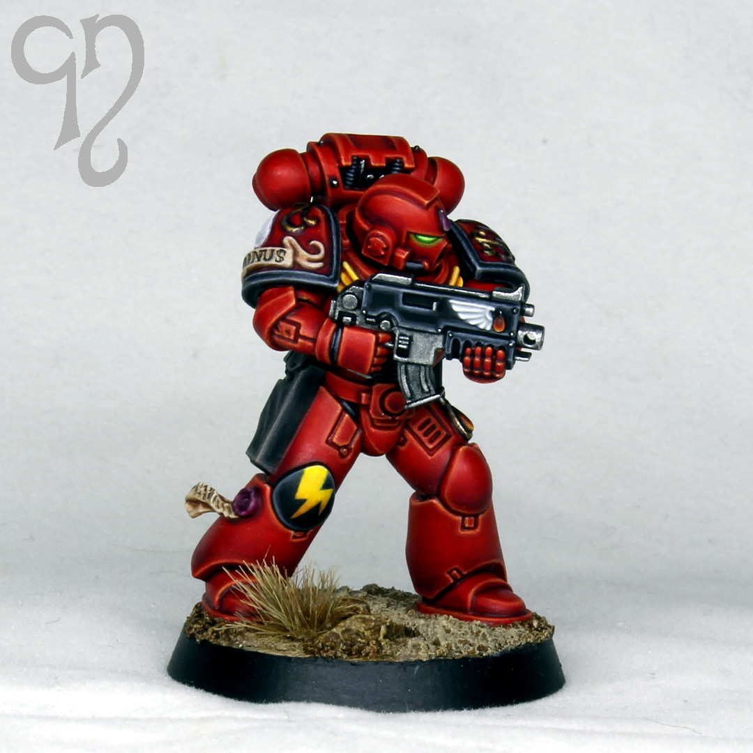
Despite painting many Blood Angels over the years, I’ve never succeeded in finding a recipe for red armour in the edge highlighted ‘Eavy Metal style that I’m totally happy with. The modern Citadel reds are fantastic, and have much better coverage than the old paints (I’m definitely not nostalgic for that!) but somehow they just don’t quite have the vibrancy that I’m looking for. After doing some more experimenting I hit upon the idea of introducing some fluorescent paint into the mix, so in the marine on the right you can see the same recipe but with a basecoat of 1:2 mephiston red and fluorescent pink from Warcolours, which I applied over a very pale flesh undercoat to maximise vibrancy. I’m much happier with the final result this gives (the effect is somewhat diminished in photos) but unfortunately using such a high proportion of fluorescent paint makes the mix a pain in the backside to use, as the coverage is terrible!
Although it’s not in keeping with the 2nd edition vibe, I decided I prefer the glowing eyes to the old school gem-style lenses, and I also decided not to use left pauldrons with sculpted Blood Angels chapter symbols. The problem is that the sculpted symbols have to be edge highlighted, and then they just don’t give the vibe that I’m after. Rather than use blank pauldrons and faff about trying to get transfers to sit nicely I digitally sculpted my own that have a barely perceptible outline of the chapter icon on them. It’s just enough to act as a guide for painting and ensure uniformity, but doesn’t create a noticeable step that catches the light.
Here we have the tactical squad sergeant. I used blender and my trusty Elegoo Mars 3 to create the decoration on the left shin and backpack, and also the banner, which is pinned into the backpack. I have no idea why banners went out of fashion – I think no sergeant should leave the battle barge without one! Anyway, with these changes he’s about as close as I could get to the original metal sergeant that I remember from my squad back in the day.
Finally here we have the squad so far. I had to go with 3rd company because Tycho is my all time favourite Blood Angels character, so I need to leave the door open to including him in the force at some point in the future. I’ve stalled a bit at this point because I need to get hold of a suitable melta gun to complete this half of the squad, and it looks like I’ll be needing to buy a box of the primaris eradicators in order to do that. I’ve also become distracted by all the shiny new eldar minis that have been coming out recently and may have painted one or two Alaitoc guardians. Well, the marines need someone to fight, don’t they?
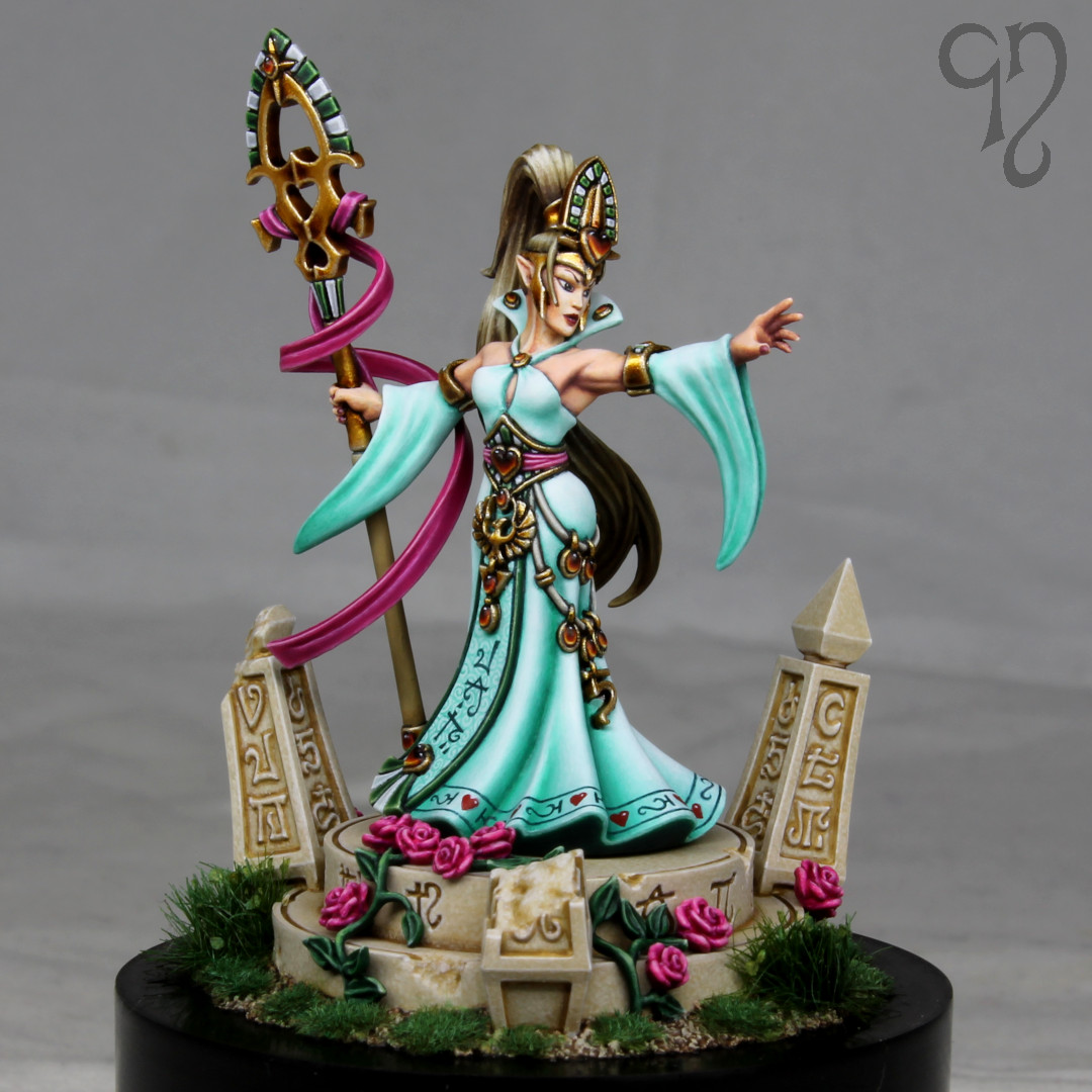
Followers of this blog may have noticed that I’m something of a fan of elves. Happily Games Workshop have got me covered whenever I feel the need to do something with space elves, but the fantasy side is a bit more tricky. I enjoyed painting Elrond from the Lord of the Rings range recently, but what I really want is the Warhammer Fantasy High Elves of my youth. Unfortunately with the advent of Age of Sigmar, the High Elf line has been abandoned in favour of Lumineth Realm Lords.
The problem for me is that while I can appreciate aspects of the Lumineth range, in the main they are not my cup of tea and I feel that the older High Elf aesthetic is superior. I certainly don’t intend any disrespect to the fine gentleman behind the Lumineth and much of the Age of Sigmar range – he is a far, far, far better and more creative miniature designer than I will ever be! But cow-themed elves with hammers and flying foxes don’t sit right with me. And it doesn’t help that many of the elves are wearing clothing that brings the tracksuit to mind. No I’m sorry, I like my elves robed and associated with fearsome beasts such as phoenixes, dragons and lions (these latter two now appropriated by the Stormcast Eternals it seems).
While I could go scouring eBay for High Elves, there are a couple of problems. Firstly, the prices on much of this stuff have got a bit silly recently. Also I’m not really interested in painting metal miniatures, and I’m certainly never going to waste another penny on finecast! What I really want is plastic, made to the standards of today but with the old aesthetic. Clearly that’s not going to happen any time soon (perhaps we can hold out a little hope of something coming with the Old World, although as that’s coming from Specialist Games I fear that resin will be more the order of the day).
I therefore decided that, as with Fuegan, it was once again time for me to sculpt my own miniature in order to create something I wanted to paint. Lately I’ve been feeling a bit jaded with the endless warlike stuff, so I wanted to explore the slightly softer side of the Warhammer setting and I decided to have a crack at Alarielle. (Obviously I’m talking about the classic High Elf Alarielle here, not her modern humongous incarnation atop a beetle.)
The most recent High Elf Alarielle miniature has a lot going for it, and I copied much of the design for my own version. Although huge hats are a staple of Warhammer, I’ve always felt that the headgear on this miniature looked a little too bulky for her delicate form and I wanted to try scaling it back a bit. I also decided to adjust the design of the staff a bit (in order to get rid of the sausage that appears to have been embedded in it) and took away some of the sculpted design on the loincloth to create a bit more room for runes, such as those on this artwork that represents the older Alarielle miniature. Classic magic user stuff here, and a lovely open pose to make the painting enjoyable.
I sculpted my version of Alarielle in blender, and printed her on my Elegoo Mars 3 at an appropriate Warhammer size (she is 32 mm to the eye). With hindsight there are of course some things I’d do differently. I think the biggest mistake I made was leaving the base of the dress solid, rather than making it a thin layer. I’ve been sculpting a great deal of small scale miniatures over the last couple of years, and I need to remember that there are some things that you can’t get away with when you go to 32 mm!
For the painting I didn’t really see how the most recent Games Workshop miniature could be improved upon. (I don’t know who painted it, but I strongly suspect the hand of Darren Latham. Possibly Joe Tomaszewski – I think it’s the right era for either of them!)
In the end, although I gave the miniature a good paint job, I didn’t paint it all the way up to what I would consider competition standard. For one thing, I don’t intend on ever putting it in a competition, but there are also some rough areas arising from the fact that this is a printed miniature. The Mars 3 is a 4k printer, and it’s an amazing piece of kit for the price, but even with it perfectly dialled in you’re still going to see some light layer lines in some places. I sanded most of these away but there were a few areas that were quite inaccessible. I’ve considered purchasing a Phrozen Sonic Mini 8k, but I’m not sure if there would be enough of an improvement over the Mars 3 to justify the expense.
I tried out the Pro Acryl golds for the first time on this miniature and I have to say I was a little disappointed with the results. I found that the coverage wasn’t great and it was very difficult to avoid building up texture with multiple layers. It’s surprising as I’ve heard very good things about these from painters that I respect. I daresay the fault is with me and further experimentation is needed. I’ve just been spoilt by Vallejo metal color I suppose, it’s just a shame they don’t make a gold with a warmer tone. I shaded the gold with Liquitex inks, and this was a more successful experiment.
As a reward for the few that have made it this far, I’ll just note down the rest of the colours I used as I know some people find it useful. The dress was painted using mixes of kabalite green from Citadel and AK white (I used lots of glazes rather than stippling as I wanted a very clean look). The skin was Vallejo basic skintone, shaded with beige red and then adding in khorne red and rhinox hide from Citadel, and highlighted with Vallejo light flesh. For the hair I used tallarn sand, ushabti bone and screaming skull from Citadel, and shaded with rhinox hide. There are some XV-88 glazes as well. Finally for the sashes and flowers I used pink 1 through 3 from warcolours (use some flow improver if you’re trying to basecoat with these – and be prepared for many layers!) and shaded with screamer pink from Citadel. The base used a similar palette to the hair.
Shockingly, it has been well over four years since I painted a Lord of the Rings miniature, and rather longer than that since I painted one where I was even moderately satisfied with the end result. In the arrogance of my younger years I actually gave away or sold almost all of my LotR pieces – at the time it seemed like no big deal as I was sure I would simply be able to paint something equally as good any time I wished. Unfortunately I’ve gradually realised over the last year or so that my ability to focus close to my face is on the wane, and that maybe my confidence was misplaced! I therefore decided to try and paint a new LotR miniature as close as I could to my old competition standard before my aged eyes deteriorate any further.
Fortunately GW has been releasing some very nice plastic LotR miniatures over recent years, although if I were being critical I would say that I miss the occasional character that isn’t armed and standing in a warlike pose. It seems that since the Perry twins left the company, the beautiful simplicity of miniatures such as Celeborn and Galadriel has been lost. I suppose the focus is very much on the tabletop game and there is no interest in making display pieces for collectors.
In any case, I was looking forward to painting Elrond, as it’s a great little miniature that offers a nice mix of materials and an un-helmeted head. Unfortunately he does have something of a closed pose, which meant that painting in sub assemblies was very much the order of the day. Before painting I gouged out some plastic to create a hole in the top of the scabbard – the limitations of injection molding meant that this was flat across the top, but I knew that simply painting this area black wouldn’t give a very convincing result, as you always get some light reflecting from the surface. My main complaint about the sculpting of the miniature is that I found the hair somewhat chaotic at the back – I would have preferred it to flow as more of a body to allow for better highlighting. The odd strand out of place is fine, but here I found it a little overdone.
I decided to deviate from the box art colour scheme based on the films, and flipped the areas of blue and green, while also going for a colder green and more of a turquoise than a pure blue. My reasoning was that these colours would balance nicely against the warm gold armour and the face, but I tested the scheme digitally before committing paint to miniature. I painted the areas of cloth with the finest stippling I could manage and introduced a little freehand design on the cape, mostly because I always used to try and get some freehand on my LotR competition pieces.
I found the armour quite challenging, partly because I’m somewhat out of practice painting non metallic metal, and partly because it’s always tricky to get a convincing result when there is sculpted detail running over the surface, such as on the vambraces. A little touch I’m quite pleased with, but that doesn’t show up very well on the photos, is that there are some green reflections painted onto the armour and chainmail where it is close to the cape. Overall I don’t think it’s the best armour I’ve ever painted, but it’s not too bad.
With LotR miniatures I always like to try and paint the face to look like the actor, but it’s generally beyond me to achieve this as the faces are only a few mm in height and in any case, I think the limitations of the injection molding mean that the underlying sculpt can’t be as true to the reality as one would wish.
For the base I simply mounted the finished miniature directly onto a plinth from Taro Modelmaker, which I built up with some Vallejo ground effects, sand, and various tufts. The ruined archway I designed and printed myself.
Throughout the process of painting I used magnification (apart from base coating – sadly this is just reality for me these days). Most of the time I find I can get by just wearing some 3.0x magnification reading glasses, but for the really fine work I can see more clearly through an Optivisor. Wearing this does give me something of the air of the 40-Year-Old-Virgin, much to my wife’s amusement, but needs must. Unfortunately I don’t have my previous LotR competition pieces to check against, but I think I have been able to get something like the same level of finish that I used to, which was the main object of the exercise. It’s comforting to know that I can still do it!
A quick look at this blog reveals that it has been quite some time since I painted a miniature to competition standard, but when a UK Golden Demon competition was announced back in March I finally found the motivation to pick up the brushes again and settle in for the long slog that this kind of project inevitably ends up being.
I didn’t have to think too long about what to paint since GW had recently released some new Eldar miniatures and this gave me the excuse I needed to break out the credit card. I briefly considered having a crack at the Avatar of Khaine but I just don’t have any interest in painting miniatures that large, so I settled on something a little more realistic.
The warlock kit is quite unusual in that it contains parts to build two miniatures. Two bodies and four arms are supplied as well as several head options, so in principle you can build a decent number of variants (although in practice I don’t think they’d look massively different from one another). In an effort to further differentiate my warlock and inspired by a piece of art by my all time favourite artist Mark Gibbons, I sculpted a new right hand and head and added fur around the shoulders. Because I prefer to sculpt digitally, the fur was particularly challenging since I had to make measurements of the physical miniature and then sculpt a piece that I hoped would fit. After a few attempts I got reasonably close and was able to use greenstuff to sculpt additional little bits of fur to fill any gaps. I also used the rough digital mock up I had made of the warlock to design the base. Making the base before I had even started painting the miniature was a departure from my usual half-arsed cobbled together effort at the end of the project, but I think ultimately it was worth holding my impatience to get started in check. All the parts I designed were printed on my Elegoo Mars 3 printer with standard Elegoo resin.
Saim Hann Eldar Warlock by Mark Gibbons that formed the inspiration for this project. Image used without permission.
I decided not to try and replicate the colours of the artwork precisely as my experience suggested that at miniature scale they were likely to look a little drab, and my preference has always been for maximum saturation bright colours! I painted the miniature in sub assemblies, even going so far as to paint texture on the inside of the robe before gluing the two parts together. Doing it this way meant that I had to fill and sand the seam on an already partially painted model but it is possible to see inside the robe from some angles and because I don’t prime my miniatures this kind of procedure is not too much of a problem.
There’s nothing particularly revolutionary about the painting techniques I used. The early stages involved a massive amount of somewhat tedious stippling on the robe, highlighting the 1:1 evil sunz scarlet and mephiston red base coat through wildrider red and fire dragon bright up to lugganath orange. I shaded the robe with naggaroth night, and also used this paint extensively elsewhere on the miniature in order to tie everything together. (For example, the gold nmm also has this paint in the deepest shading, and it is also used in highlights on the armour, the gems and of course the base!)
The idea behind the piece is that the warlock is engaged in some psychic shenanigans, so I made extensive use of vallejo magenta paint for these aspects and even mixed in some warcolours fluorescent pink to really get that visual punch, although sadly it doesn’t really come across in these photos. The base is supposed to be breaking up around him due to the power of the eldritch magics, and I used the magenta in these areas to try and get that narrative across.
There was a decent amount of freehand to get through, with the robes, sash and helmet all having these elements. No matter how many times I paint freehand designs, I always find it a slightly stressful experience, as there is always the knowledge that you can’t really make too many mistakes or you will quickly find yourself building up texture that is the enemy of a silky smooth finish. I’m happy to say that it went reasonably well on this occasion! The only other areas of note that occur are the light weathering I painted onto the pouches and the very fine texture on the sash, making it look like a different fabric to the robe.
During the course of painting this miniature I was forced to accept that time has definitely started to catch up with me and my ability to focus very closely is now on the wane. Fortunately I found that using a pair of reading glasses enabled me to achieve the level of finish I was after. Unfortunately this does further affect my motivation for display level miniature painting, as it’s even more difficult to justify putting in the hours when I can’t even fully appreciate the finished piece without some kind of optical aid!
It was my intention to enter this miniature in the 40k single mini category at the 2022 UK Golden Demon and take Fuegan along to put in the open category. Sadly I won’t be able to attend this event because someone at GW decided that having not had a Golden Demon for three years it would be a good idea to hold it at Warhammer World, which has a very limited capacity. When the event was announced it was obvious to me that ticket availability was going to be a massive problem, and so it has proved! I’m not particularly bothered about being denied the opportunity to collect more trophies, but I was looking forward to seeing all the great people in the community that I haven’t spoken to for a very long time. I know many other painters have missed out on getting tickets too, so all in all it is very disappointing.
And finally, it would of course be a crime to write any blog post about Eldar without acknowledging the mighty Jes Goodwin, without whom none of this would have been possible. You’re a legend sir!
When primaris space marines were revealed back in 2017, I really liked the new proportions and design but had mixed feelings about the move away from the classic mark 7 armour (and earlier marks) that I grew up with. It’s purely nostalgia I think – it doesn’t matter how amazing the new miniatures are, they just can’t recapture that golden era of my youth!
The problem is that once I’d had my eyes opened to the new space marine proportions, it was difficult to look at the classic marines and not see their underdeveloped legs and lack of abdomen! So sometime last year I thought it would be a fun little project to make a mark 7 tactical marine in primaris scale.
The miniature you see here was made from scratch in blender, using measurements I took from a primaris marine to get the proportions right. I thought it would be fun to add a few blood angel specific bits of bling and I tried out some swirly embellishments on the pauldrons, but I think the mini actually would have been better without these. I printed it on my Elegoo Mars 3, using standard Elegoo resin.
I kept the paint job nice and simple since I didn’t want to get bogged down spending a long time on what was just supposed to be a bit of fun. Just an ‘Eavy Metal style but trying to bring some of that second edition blood angels flavour in with the black rims on the pauldrons and the bright yellow chest eagle! I suppose I should have gone all in with a goblin green base really. Maybe next time!
For those that want to know my recipe for the red armour, it’s as follows:
Basecoat 1:1 mephiston red and evil sunz scarlet over a very pale flesh coloured primer (white would be fine, it’s all about getting a really vibrant red).
Shade with khorne red, then a khorne and incubi mix and finally black in the deepest recesses.
Edge highlight with evil sunz scarlet, wild rider red, fire dragon bright and small spots of lugganath orange.
Part 1 of this project is here (if you’d like to read me waffling on about the 90s and how amazing Jes Goodwin is). There didn’t seem much point in producing a painting guide for this miniature since no one else will be painting it, so I didn’t take any work in progress photos but I have made more of an effort than usual to explain my approach and the colours I used. It’s a lot of information but hopefully a few people will find it useful.
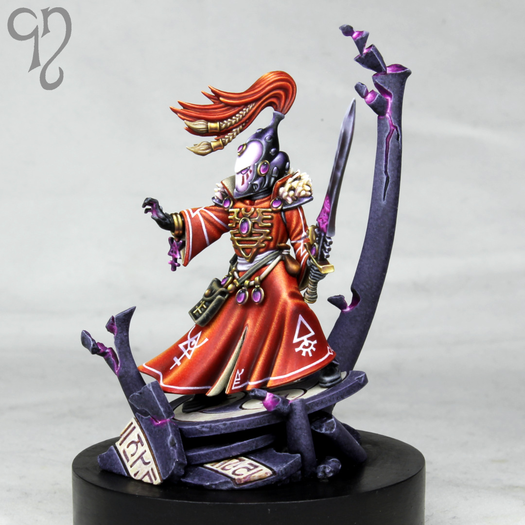
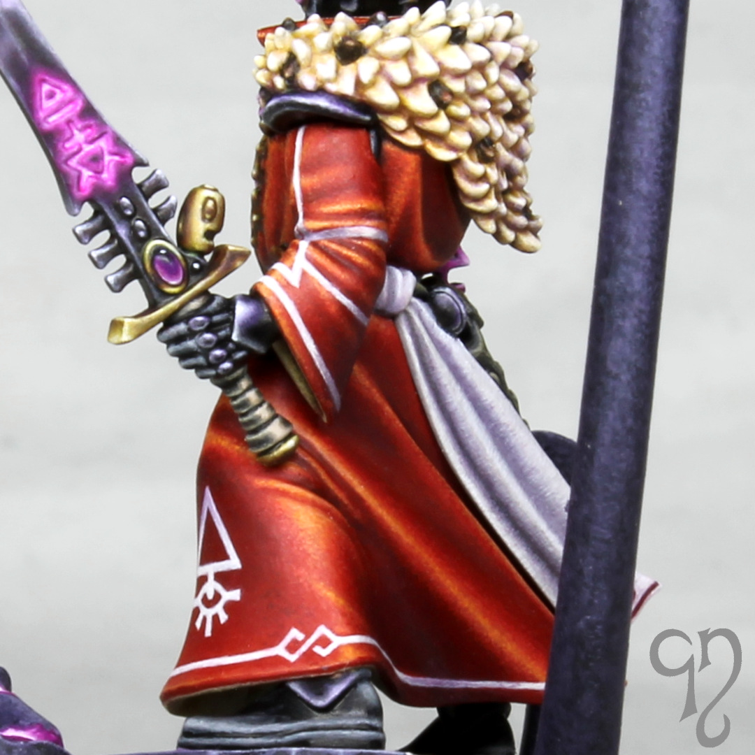
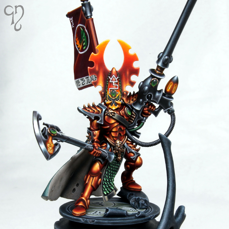
After a few test prints of Fuegan on my Elegoo Mars, I was fortunate enough to be able to get a really high quality print on a much more expensive machine from a friend. Although the budget resin printers are getting really good these days, there is still a noticeable difference in the sharpness and dimensional accuracy that a £10k machine can achieve vs a £200 machine (as there should be)!
The test prints afforded me a great opportunity to test out colour schemes before committing to the top quality print. I looked first at the current ‘Eavy Metal miniature, and although I really liked the moody, brooding atmosphere that the dark helmet evokes, I was concerned that if I did something similar on my miniature I risked losing focus on the head, as I knew there would be bright elements elsewhere.
I knew that I would definitely be using suitably fiery colours ranging from deep red through to yellow for the armour, so the main things I needed to resolve were the complimentary colours I would use and what to do with the helmet.
Inspired by some vivid sunsets, I was attracted to the idea of using magenta and violet for the scales, gems and cape. The test looked good, and I liked the tie-in with the narrative (since the eldar are in the sunset of their days). I very nearly went this way but ultimately I went with the less adventurous green because I felt it gave more pop as a spot colour.
I tried a few different options for the helmet, including having the helmet itself dark and the face plate light, and painting the whole of the helmet in yellow for maximum brightness. Although I didn’t particularly like either of these, I did discover that using pure yellow on the miniature just wasn’t working for me so in the end I didn’t go more yellow than a 1:1 mix of trollslayer orange and yriel yellow. I used this colour around the face plate to really draw the viewer’s eye and then faded through to gal vorbak red. The wings on either side faded in the opposite direction, and I found that I liked the ambiguity between light reflection and flames in the highlights I painted towards the bottom of these.
I considered using metallic paint on the miniature for metal elements, but I decided against it because I thought I would be able to achieve a better looking result on the axe head with the glowing rune if I went with non metallic metal. If I had only to consider the copper elements I probably would have gone with true metallic because I love the way it looks in the hand but as it was I had to work out a recipe for copper nmm, as I couldn’t remember how I’d approached it before!
It had been quite some time since I had attempted to paint to my highest standard and discovered that it took a little while to feel comfortable with my techniques again. I do sometimes feel that my painting is being left behind by the incredible advances in the wider community but sculpting has to be my focus at the moment and sadly that means that I don’t have as much time to devote to trying to improve my painting game! I ended up painting this miniature very gradually over the course of a few months in my spare time.
Because I had already done my colour tests I was able to paint the miniature in sub assemblies with confidence that it would work when put together. In practice this just meant painting the cloak, banner and head separately, and also the barrel of the pike because it’s so long I knew I’d keep snapping it off if I attached it too soon! I hadn’t decided on the colour of the base (or even finished sculpting it) when I started painting the miniature in order to continue my long held tradition of leaving it as an afterthought. 😉
Armour
I began the painting with the armour since it is the bulk of the miniature. I started with a base coat of 1:1 mephiston red and evil sunz scarlet that I painted directly onto the resin (after fully curing it and washing it with warm soapy water of course). It’s amazing how well paint goes onto the resin that you get from 3D printers (or at least the resins I’ve encountered), and I was pleased not to need to break out the airbrush for a smooth base coat, which always feels like a hassle.
Those who have purchased one of my painting guides will be familiar with the techniques I like to use to achieve the area highlights and I used the same approach here. I worked up through highlights of wildrider red, firedragon bright, lugganath orange and then added to white to this. Shading was with gal vorbak red and I then added some black to this.
I smoothed the transitions with very focused glazes made from all of the colours I had used plus pure evil sunz, but I felt that the armour still lacked a little punch so I glazed incubi darkness into the shadows and added very thin glazes of 1:1 trollslayer orange and yriel yellow over the highlights. The smaller reflection highlights on the armour were added after I’d painted the rest of the miniature. I just placed these anywhere I thought the miniature could benefit from them – there was certainly no science behind it! The incubi darkness ended up being a unifying colour that I used across several elements of the miniature (including the base).
I painted the undersuit of the armour using the same colours but didn’t apply the yellowish glaze, just to provide a subtle little difference between the two areas.
Helmet
For the helmet I started with a base coat of bone, again painted on with a large brush onto the bare resin. This enabled me to get the brightest colours possible when I painted over the top of it, and the helmet was going to be all about bright colours!
Over the base coat I started with my 1:1 mix of trollslayer and yriel yellow in the areas that would end up this colour and extending out until about half the area of the helmet and wings were covered. I then switched to pure trollslayer orange and painted layers with the brush strokes starting in the yellow and moving away into the area that was still bone. I thinned the paint so that I was able to gradually build up a smooth transition (although a certain amount of remedial glazing was still needed later). This process was then repeated with evil sunz scarlet (starting in the orange) and gal vorbak red (starting in the evil sunz), finally adding some black to the gal vorbak for the deep recess shading. I then used the incubi darkness glaze into the shadows.
With the colour transitions done I then moved on to highlighting the helmet. I used the same colours as I had used on the armour for this and I applied edge highlights at the same time as the flame-like larger highlights towards the bottom of the wings. Towards the top of the helmet I didn’t use oranges in the edge highlights and just added white into the colours I had used.
Black elements
The armour trim, the pike and the handle of the axe were all painted in the same way. I began with a black base coat and then highlighted with eshin grey, dawnstone, and administratum grey before adding a little white to this last colour. I made the highlights on the upper edges brighter than those below and I found that quite a bit of glazing was necessary to tidy up some of the highlights, particularly the very long thin ones on the pike. Fairly late on I glazed a little incubi darkness over the highlights on these elements and re-established the brightest dots to make these elements colder and contrast more strongly against the armour.
The other black elements are the trim around the tabard and the strap across Fuegan’s chest. I wanted these to be warmer and didn’t want to bust out more paints, so I ended up mixing lugganath orange and vmc sunny skintone into the black and then adding a little white. I think it looks ok but I discovered that lugganath orange really doesn’t play nicely with black and it took some pains to get the transitions smooth.
Cape
The outside of the cape was base coated with a mix of incubi darkness and black and I highlighted this with incubi darkness and then added sunny skintone. After applying some fairly rough highlights I switched to stippling in order to add some interesting texture (I have covered this approach in more detail in the aforementioned painting guides). I also painted a few fine little scratches here and there, since I imagine that whatever beastie it was taken from probably had quite a hard life.
The scales on the cape were painted in the same way as those on the tabard and the side of the helmet. A base coat of caliban green was highlighted with warpstone green and then sunny skintone was added to the warpstone green. Shading was with black and a little incubi darkness.
I wanted a warm tone for the inside of the cape so started with a basecoat of rakarth flesh and shaded this by mixing in skavenblight dinge. I highlighted with vmc deck tan and again employed stippling to add texture. In this case I picked out a few areas and made them a little darker to try and make the surface feel less uniform and artificial. With this process complete I felt the inside of the cloak still looked a little lifeless so I glazed a little incubi darkness over the darker areas and stippled a tiny amount of sunny skintone into the highlights.
Banner
The banner was base coated with gal vorbak red and then highlighted with the same range of colours I had used on the armour. I practiced the freehand design on one of my test prints and then took a deep breath and dived in! I used leather white (from reaper) as my weapon of choice to get a smooth white for the strip along the bottom, the circle around the dragon and the fire dragon rune with a fair amount of winsor & newton acrylic flow improver added. The key is always to start with a heavily diluted paint and sketch in the design before gradually refining with slightly thicker paint until you get something that looks half way decent.
For the eldar runes along the bottom I added some winsor & newton black ink to black paint. I have experimented with using pure black ink for this type of thing but I don’t really get on with it – it seems too easy to remove it from the surface and I don’t seem to get quite the same sharp finish. I added just enough black ink to make the paint flow nicely with some water in the mix. To be honest I probably could have just used the flow improver – all that matters is that the paint comes off the brush easily. I used a size 1 brush for all the freehand work. Actually I used size 1 brushes for pretty much the entire paint job, but I reserved the ones with good points for this kind of work.
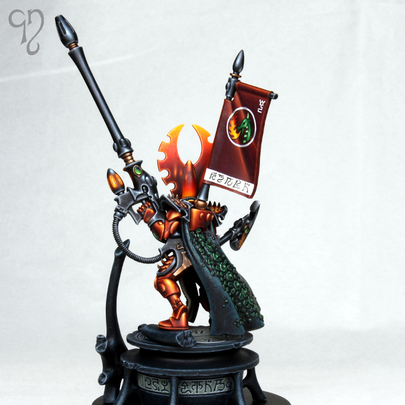
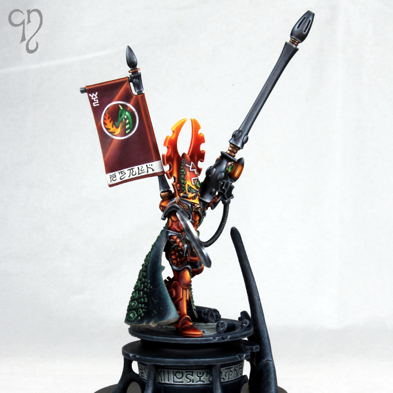
I wanted to the banner to feature a dragon breathing fire so that when viewed from the front, the flame colour combined with the glow on the two weapons forms a triangle around the helmet. I used the same colours for the dragon and the flame that I used elsewhere on the miniature.
Non metallic metal recipes
For the copper areas I base coated with doombull brown and highlighted with mournfang brown and deathclaw brown. Shading was with rhinox hide and then black. I added white to deathclaw brown for the extreme highlights and applied some thin glazes of the same 1:1 trollslayer orange and yriel yellow mix that I used on the armour before re-establishing the extreme highlights with white.
For the axe head I base coated with mechanicus standard grey and highlighted with administratum grey and white. I shaded with a mix of gal vorbak and black rather than pure black to add a little visual interest. I glazed some of the highlights with the orange/yellow mix and some with incubi darkness, particularly those on the underside since by this stage I knew that the base would also be using this colour.
Glowing effect and gems
For the fiery glow on both the axe and the pike I first applied pure white directly into the recesses to maximise the brightness of the subsequent layers. I then built up the glow working from the outside in, starting with gal vorbak red, then evil sunz scarlet, trollslayer orange and then adding yriel yellow. The paint was thin enough that it took several applications to build up the full opacity so that smooth transitions could be created. I reapplied white more sparingly into the deepest recesses and tidied up the glow anywhere it needed it with focused glazes.
For the gems I started with black and painted most of the area with caliban green, leaving a small area of black towards the top. I then highlighted the bottom of the gems and around the edges with warpstone glow and then moot green within this area. I added white to the moot green for the extreme highlights and pure white reflection spots of course.
Base
For the base I used a mix of incubi darkness and little black and then built up quite a rough stippled texture with incubi darkness and then with administratum grey added to the incubi darkness (to differentiate it from the back of the cloak which used warmer highlights). The inlaid runes around the edge and on the top had a little moot green added in to dawnstone and then these were stippled and edge highlighted with administratum grey and white.
And with that, the project was done! To finish, here’s a few close ups:
The very first miniature that I made for Games Workshop as a trainee has now been released, so I can finally talk about it!
Xandria Azurebolt (as someone in publications has elected to name her) is the exclusive knight incantor model that comes with issue 5 of the Mortal Realms magazine for Age of Sigmar.
I’d been at GW for less than a month when I was given the brief to make this miniature. After becoming familiar with the team and the software, all the trainee miniature designers are given 3 or 4 training projects. These projects are not in the release schedule so you’re not under time pressure and although you’re told that it would be nice if you produced something that could be released, it’s not expected at this stage.
This then was my first training project in the summer of 2018. To be honest I’ve never been massively excited by Stormcast Eternals but I was given a really cool mock up that Steve Party had made and let loose to try and turn it into a product. The main areas of design work were the stave and the head. I remember going through quite a few iterations of the face until I got something I was reasonably satisfied with.
I was sitting at the desk next to the mighty Darren Latham when I worked on this, and he gave me a lot of help figuring out the engineering side, which was much appreciated. I think it’s fair to say that anything good about the final miniature is down to Steve and Daz, and anything not so good is down to yours truly! But I was pleased when the design managers told me that it would be getting produced.
I decided to paint this in non metallic metal, which was a decision I soon came to regret, because as usual it took me far longer than I wanted it to! I don’t think the finish is as good as it could be in a few places but I didn’t think it was worth investing any more time to try and make it better. There are far more interesting miniatures that I’d like to paint!
I haven’t got much history with Sisters of Battle, since their second edition codex was released just after I’d drifted away from the hobby, and by the time I came back they had been unsupported for so long that they weren’t really relevant. For that reason I wasn’t particularly interested when the news broke that they were to be re-imagined in plastic. But it just goes to show that you should never be closed minded, because now the Adeptus Sororitas are here and I absolutely love them!
These miniatures are from the multi part battle sisters kit that Joe Tomaszewski designed (with I would imagine significant input from project lead Martin Footit and design manager Ben Jefferson). Joe has outdone himself with this kit – it’s simply fantastic! So many options, fantastic poses, beautifully rendered cloth… the list goes on and on.
The only slight negative for me about the sisters is that the 6 official orders don’t have the widest range of colour schemes – it’s very much variations on white, red and black. So I decided to invent my own order and be totally revolutionary by throwing purple into the mix.
I’ve gone for a fairly standard ‘Eavy Metal style of painting on these because I didn’t want to spend forever on them, and I’m happy with the result considering the time spent. On the superior I tried out a different skin tone to my usual recipes, which I think turned out ok, and of course I couldn’t resist a bit of non metallic metal on the sword blade.
Of course, now I’m being severely tempted by the Triumph of Saint Catherine (which should probably be referred to as the Triumph of Mr Footit). I don’t think I can commit the time it deserves to it though – maybe in the next lifetime!
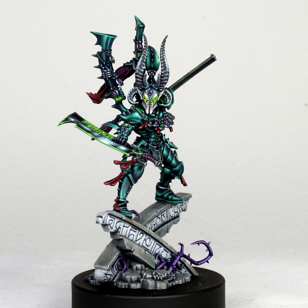
When I left Games Workshop I was surprised and overwhelmed by the generosity of Gaku Matsubayashi, who gave me a copy of Jes Goodwin’s Eldar sketchbook as a leaving gift. Of course, I had to do something to try and repay such generosity, so I painted the Howling Banshee Exarch as a gift for Gaku (he sculpted the excellent plastic banshees kit).
I wanted to try a different colour scheme, and settled on the classic combination of magenta/purple and teal, despite some misgivings about it being a bit too Slaaneshy. I decided to retain the pale armour, but moved away from the bone into warm grey (I used pallid wych flesh shaded with skavenblight dinge). I didn’t want to make this look super reflective and shiny (I imagined more of a plastic, super advanced lightweight material), so I just shaded towards the recesses and in one or two other areas to add some visual interest, and edge highlighted with white.
I decided to try something different to the classic Eldar crystalline sword, so I used more of a conventional non metallic metal approach, but introduced more teal towards the body of the miniature to try and guide the eye inwards. The small details are painted with true metallic paints, which I always find add an extra level of contrast when viewing the miniature in the hand (but unfortunately doesn’t translate so well to photos).
I don’t want to criticise the ‘Eavy Metal team, who I think do wonderful work (to tight deadlines). But I do think that they sometimes have a tendency to go too far with the shading on female faces, with the result that to me they often look quite masculine. I’ve gone for a more subtle approach here, which is much more to my taste. Fortunately Gaku has sculpted some lovely big, well defined eyes so I was able to paint the irises without too much difficulty!
I also painted one of the optional exarch helmets to see how it would look, but in the end preferred the unhelmeted version, so that was the one I glued in place before giving the miniature to Gaku.
On my first day in the Games Workshop miniatures design studio I was thrilled to be shown to my desk alongside the mighty Darren Latham. Once I’d recovered sufficiently from this excitement I was delighted to find that he was in the process of sculpting a new version of Drazhar (with plenty of input from the legendary Jes Goodwin of course).
Long time readers of my blog may remember that I tried my hand at sculpting my own version of Drazhar before I joined GW, based on some codex artwork. Although I was quite pleased with it at the time, looking back on this piece now it’s quite obvious that I got the proportions wrong, among various other deficiencies. So I was really pleased to get my hands on the fantastic new version. It’s a lovely kit, goes together really nicely, and can be almost fully assembled before painting (I think I painted the head separately).
I wanted to revisit the green armour I used previously, so I went with a similar colour scheme to my previous version. For the armour I used incubi darkness, kabalite green and sybarite green, mixing white into the final highlights and shading the deepest recesses with a mix of naggaroth night and black. Rather than using gold I went with silver non metallic metal, and the spot colour was moot green.
I’m afraid there won’t be a painting tutorial for this miniature as I didn’t take many photos during the painting process but I’m pleased to say that my Etsy shop is now open again and there will be some new guides coming soon!