Part 1 of this project is here (if you’d like to read me waffling on about the 90s and how amazing Jes Goodwin is). There didn’t seem much point in producing a painting guide for this miniature since no one else will be painting it, so I didn’t take any work in progress photos but I have made more of an effort than usual to explain my approach and the colours I used. It’s a lot of information but hopefully a few people will find it useful.

After a few test prints of Fuegan on my Elegoo Mars, I was fortunate enough to be able to get a really high quality print on a much more expensive machine from a friend. Although the budget resin printers are getting really good these days, there is still a noticeable difference in the sharpness and dimensional accuracy that a £10k machine can achieve vs a £200 machine (as there should be)!
The test prints afforded me a great opportunity to test out colour schemes before committing to the top quality print. I looked first at the current ‘Eavy Metal miniature, and although I really liked the moody, brooding atmosphere that the dark helmet evokes, I was concerned that if I did something similar on my miniature I risked losing focus on the head, as I knew there would be bright elements elsewhere.
I knew that I would definitely be using suitably fiery colours ranging from deep red through to yellow for the armour, so the main things I needed to resolve were the complimentary colours I would use and what to do with the helmet.
Inspired by some vivid sunsets, I was attracted to the idea of using magenta and violet for the scales, gems and cape. The test looked good, and I liked the tie-in with the narrative (since the eldar are in the sunset of their days). I very nearly went this way but ultimately I went with the less adventurous green because I felt it gave more pop as a spot colour.

I tried a few different options for the helmet, including having the helmet itself dark and the face plate light, and painting the whole of the helmet in yellow for maximum brightness. Although I didn’t particularly like either of these, I did discover that using pure yellow on the miniature just wasn’t working for me so in the end I didn’t go more yellow than a 1:1 mix of trollslayer orange and yriel yellow. I used this colour around the face plate to really draw the viewer’s eye and then faded through to gal vorbak red. The wings on either side faded in the opposite direction, and I found that I liked the ambiguity between light reflection and flames in the highlights I painted towards the bottom of these.
I considered using metallic paint on the miniature for metal elements, but I decided against it because I thought I would be able to achieve a better looking result on the axe head with the glowing rune if I went with non metallic metal. If I had only to consider the copper elements I probably would have gone with true metallic because I love the way it looks in the hand but as it was I had to work out a recipe for copper nmm, as I couldn’t remember how I’d approached it before!

It had been quite some time since I had attempted to paint to my highest standard and discovered that it took a little while to feel comfortable with my techniques again. I do sometimes feel that my painting is being left behind by the incredible advances in the wider community but sculpting has to be my focus at the moment and sadly that means that I don’t have as much time to devote to trying to improve my painting game! I ended up painting this miniature very gradually over the course of a few months in my spare time.
Because I had already done my colour tests I was able to paint the miniature in sub assemblies with confidence that it would work when put together. In practice this just meant painting the cloak, banner and head separately, and also the barrel of the pike because it’s so long I knew I’d keep snapping it off if I attached it too soon! I hadn’t decided on the colour of the base (or even finished sculpting it) when I started painting the miniature in order to continue my long held tradition of leaving it as an afterthought. 😉
Armour
I began the painting with the armour since it is the bulk of the miniature. I started with a base coat of 1:1 mephiston red and evil sunz scarlet that I painted directly onto the resin (after fully curing it and washing it with warm soapy water of course). It’s amazing how well paint goes onto the resin that you get from 3D printers (or at least the resins I’ve encountered), and I was pleased not to need to break out the airbrush for a smooth base coat, which always feels like a hassle.
Those who have purchased one of my painting guides will be familiar with the techniques I like to use to achieve the area highlights and I used the same approach here. I worked up through highlights of wildrider red, firedragon bright, lugganath orange and then added to white to this. Shading was with gal vorbak red and I then added some black to this.
I smoothed the transitions with very focused glazes made from all of the colours I had used plus pure evil sunz, but I felt that the armour still lacked a little punch so I glazed incubi darkness into the shadows and added very thin glazes of 1:1 trollslayer orange and yriel yellow over the highlights. The smaller reflection highlights on the armour were added after I’d painted the rest of the miniature. I just placed these anywhere I thought the miniature could benefit from them – there was certainly no science behind it! The incubi darkness ended up being a unifying colour that I used across several elements of the miniature (including the base).
I painted the undersuit of the armour using the same colours but didn’t apply the yellowish glaze, just to provide a subtle little difference between the two areas.
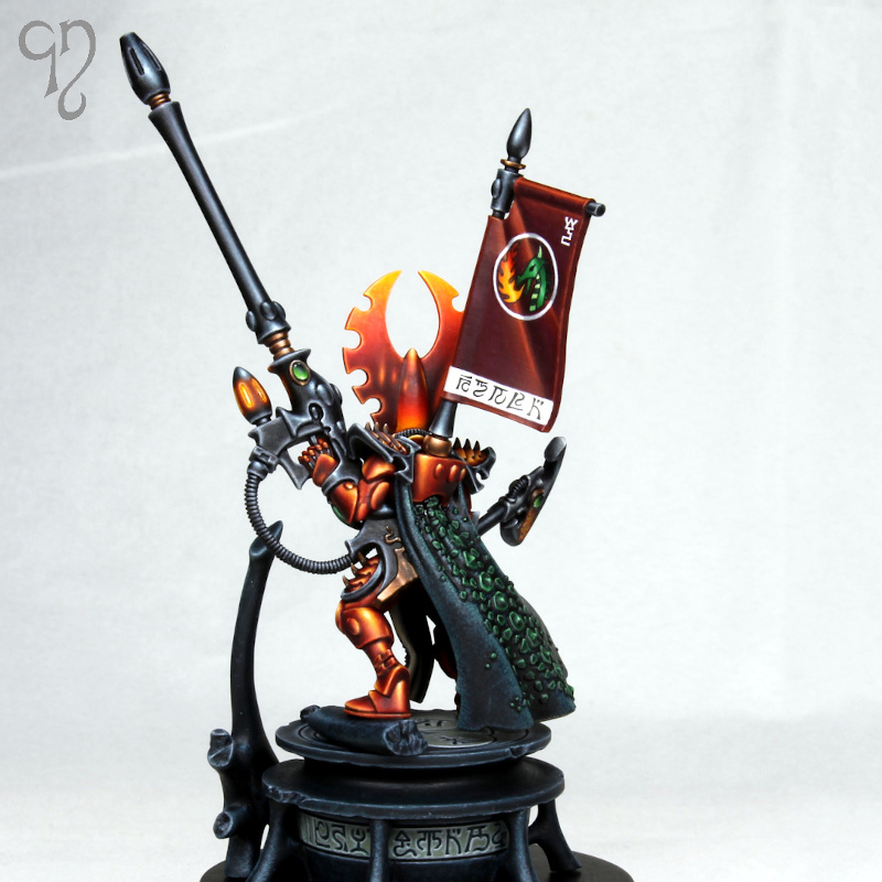
Helmet
For the helmet I started with a base coat of bone, again painted on with a large brush onto the bare resin. This enabled me to get the brightest colours possible when I painted over the top of it, and the helmet was going to be all about bright colours!
Over the base coat I started with my 1:1 mix of trollslayer and yriel yellow in the areas that would end up this colour and extending out until about half the area of the helmet and wings were covered. I then switched to pure trollslayer orange and painted layers with the brush strokes starting in the yellow and moving away into the area that was still bone. I thinned the paint so that I was able to gradually build up a smooth transition (although a certain amount of remedial glazing was still needed later). This process was then repeated with evil sunz scarlet (starting in the orange) and gal vorbak red (starting in the evil sunz), finally adding some black to the gal vorbak for the deep recess shading. I then used the incubi darkness glaze into the shadows.
With the colour transitions done I then moved on to highlighting the helmet. I used the same colours as I had used on the armour for this and I applied edge highlights at the same time as the flame-like larger highlights towards the bottom of the wings. Towards the top of the helmet I didn’t use oranges in the edge highlights and just added white into the colours I had used.
Black elements
The armour trim, the pike and the handle of the axe were all painted in the same way. I began with a black base coat and then highlighted with eshin grey, dawnstone, and administratum grey before adding a little white to this last colour. I made the highlights on the upper edges brighter than those below and I found that quite a bit of glazing was necessary to tidy up some of the highlights, particularly the very long thin ones on the pike. Fairly late on I glazed a little incubi darkness over the highlights on these elements and re-established the brightest dots to make these elements colder and contrast more strongly against the armour.
The other black elements are the trim around the tabard and the strap across Fuegan’s chest. I wanted these to be warmer and didn’t want to bust out more paints, so I ended up mixing lugganath orange and vmc sunny skintone into the black and then adding a little white. I think it looks ok but I discovered that lugganath orange really doesn’t play nicely with black and it took some pains to get the transitions smooth.

Cape
The outside of the cape was base coated with a mix of incubi darkness and black and I highlighted this with incubi darkness and then added sunny skintone. After applying some fairly rough highlights I switched to stippling in order to add some interesting texture (I have covered this approach in more detail in the aforementioned painting guides). I also painted a few fine little scratches here and there, since I imagine that whatever beastie it was taken from probably had quite a hard life.
The scales on the cape were painted in the same way as those on the tabard and the side of the helmet. A base coat of caliban green was highlighted with warpstone green and then sunny skintone was added to the warpstone green. Shading was with black and a little incubi darkness.
I wanted a warm tone for the inside of the cape so started with a basecoat of rakarth flesh and shaded this by mixing in skavenblight dinge. I highlighted with vmc deck tan and again employed stippling to add texture. In this case I picked out a few areas and made them a little darker to try and make the surface feel less uniform and artificial. With this process complete I felt the inside of the cloak still looked a little lifeless so I glazed a little incubi darkness over the darker areas and stippled a tiny amount of sunny skintone into the highlights.
Banner
The banner was base coated with gal vorbak red and then highlighted with the same range of colours I had used on the armour. I practiced the freehand design on one of my test prints and then took a deep breath and dived in! I used leather white (from reaper) as my weapon of choice to get a smooth white for the strip along the bottom, the circle around the dragon and the fire dragon rune with a fair amount of winsor & newton acrylic flow improver added. The key is always to start with a heavily diluted paint and sketch in the design before gradually refining with slightly thicker paint until you get something that looks half way decent.
For the eldar runes along the bottom I added some winsor & newton black ink to black paint. I have experimented with using pure black ink for this type of thing but I don’t really get on with it – it seems too easy to remove it from the surface and I don’t seem to get quite the same sharp finish. I added just enough black ink to make the paint flow nicely with some water in the mix. To be honest I probably could have just used the flow improver – all that matters is that the paint comes off the brush easily. I used a size 1 brush for all the freehand work. Actually I used size 1 brushes for pretty much the entire paint job, but I reserved the ones with good points for this kind of work.
I wanted to the banner to feature a dragon breathing fire so that when viewed from the front, the flame colour combined with the glow on the two weapons forms a triangle around the helmet. I used the same colours for the dragon and the flame that I used elsewhere on the miniature.
Non metallic metal recipes
For the copper areas I base coated with doombull brown and highlighted with mournfang brown and deathclaw brown. Shading was with rhinox hide and then black. I added white to deathclaw brown for the extreme highlights and applied some thin glazes of the same 1:1 trollslayer orange and yriel yellow mix that I used on the armour before re-establishing the extreme highlights with white.
For the axe head I base coated with mechanicus standard grey and highlighted with administratum grey and white. I shaded with a mix of gal vorbak and black rather than pure black to add a little visual interest. I glazed some of the highlights with the orange/yellow mix and some with incubi darkness, particularly those on the underside since by this stage I knew that the base would also be using this colour.
Glowing effect and gems
For the fiery glow on both the axe and the pike I first applied pure white directly into the recesses to maximise the brightness of the subsequent layers. I then built up the glow working from the outside in, starting with gal vorbak red, then evil sunz scarlet, trollslayer orange and then adding yriel yellow. The paint was thin enough that it took several applications to build up the full opacity so that smooth transitions could be created. I reapplied white more sparingly into the deepest recesses and tidied up the glow anywhere it needed it with focused glazes.
For the gems I started with black and painted most of the area with caliban green, leaving a small area of black towards the top. I then highlighted the bottom of the gems and around the edges with warpstone glow and then moot green within this area. I added white to the moot green for the extreme highlights and pure white reflection spots of course.
Base
For the base I used a mix of incubi darkness and little black and then built up quite a rough stippled texture with incubi darkness and then with administratum grey added to the incubi darkness (to differentiate it from the back of the cloak which used warmer highlights). The inlaid runes around the edge and on the top had a little moot green added in to dawnstone and then these were stippled and edge highlighted with administratum grey and white.
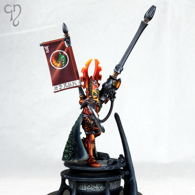
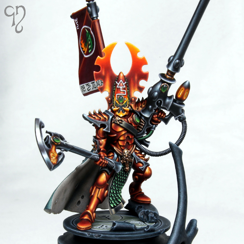
And with that, the project was done! To finish, here’s a few close ups:


Eldar are just un the dawn of their new empiré, mon kheigh !!
Great job 🙂
But by the way, guides are good even if you dont paint the same miniature.
Have a good day !
LikeLike
Fantastic work, love to see your painting and sculpting. I remember you frequenting I think it was Platoon Britannica years ago and being a painter to look up to then. Trying to get back into the hobby again now and it’s great to still see your inspiring work.
LikeLiked by 1 person
Thanks! I remember your username from the glory days on the forum. Cool that you’re getting back into it!
LikeLike
Just found your website, thank you for the inspiration and nostalgia trip! I began collecting in the mid-late 80s and you posting the backcover of White Dward 139 in part 1 really took me back! Fantastic sculpt, glad you gave it the print it deserved!
LikeLike
Thanks!
LikeLike
Any plans on going to Patreon or making more tutorials?
LikeLike
No plans at the moment I’m afraid. I don’t think that there’s a lack of good content out there though!
LikeLike
What a wonderful sculpt and what a good time we’re in as eldar players (even if this one isn’t going public).
At first I thought the guardian kit didn’t need a new one but the proportions just slaps, thanks for sharing
LikeLiked by 1 person