Gallery

Vampire Lord

v4front_blogv4side_blogv4rear_blog

For your viewing pleasure, here are some renders of my latest sculpt. I’ve always harboured a vague desire to paint a vampire but somehow never come across one that has been quite what I was looking for. So I thought I’d have a go at making my own!

As with my Dragon Maiden I’ve aimed to work in a similar scale to the Warhammer range, although this guy is a fair bit bigger than she is. (32 mm to the eye rather than 30, and considerably more bulky!)

As usual I’ve tried to exaggerate all the details enough so that they will print well and be enjoyable to paint. This is actually version 2 of the vampire lord, after I discovered that amongst other things I’d made the fangs far too small in the original and they were basically invisible in the print. Fingers crossed I got it right this time…

I’ve tried to convey a sense that this guy has been around for a good few years with the slightly shabby chainmail and cape, but I also intend to add some more signs of wear with paint. This is now on order from Shapeways so if it prints nicely then I hope to be able to share a painted version in a few weeks!

Gallery

Storm of Sigmar: Retributors

Just a quick update as I have now completed the Stormcast from the Storm of Sigmar box with this handsome pair of Paladin Retributors!

retributors1retributors2

As with the liberators, these were mostly painted on the sofa after work, with the intention of achieving a decent tabletop standard. These are very nice models, although personally I’m not a massive fan of the backpacks. Maybe there’s some explanation for them in the background that I’m unaware of.

Here’s the obligatory group shot:

stormcast_complete

If I paint any more of these I’m going to need a bigger photography backdrop! Just as well I have to turn to the Khorne side of the box now. Still mulling over the colour scheme for those guys…


Small Ox Miniatures: what’s in the box?

Ok, you’ve ordered your exquisitely crafted Small Ox Miniatures from Shapeways, what happens next?

Shapeways will print your order and ship it out to you via UPS. Recently I’ve been getting miniatures in my hand less than a week after placing the order, but it is possible that you’ll have to wait a little longer if there is a lot of demand on the printers.

Inside your (overly large) cardboard box you’ll find plenty of padding, and packages like this:

shapeways1

The amount of packaging would have you believe we’re dealing with extremely fragile pieces here, but actually the miniatures are made of a reasonably flexible plastic and are quite robust.

Inside the bubble wrap your miniatures will look something like this:

shapeways2shapeways3

The price of the miniatures is determined by amount of material they use, but there is also a fixed charge per part. By connecting the miniatures together in this way, the ‘per part’ cost is only incurred once which makes them as inexpensive as possible.*

You can see that due to the thinness of the connecting plastic it has warped a bit, illustrating the flexibility. Doesn’t matter anyway – we don’t want that bit!

Here are super close ups of one of the miniatures (this is 15 mm scale, so  very small):

shapeways2closeshapeways3close

You can see that the material is pretty smooth right out of the packet. The front side of the miniatures is smoother and less glossy than the back because of the way the miniatures are oriented during printing.

Shapeways add some supports as part of the printing process. The little nubs you can see mostly on the back and underside of the miniatures are the remnants of these.

To get your miniatures ready for painting, simply cut the connecting plastic with clippers. A sharp scalpel will make short work of the remnants of the supports.

You can paint the miniature as it is, although I would recommend giving it a gentle scrub in warm soapy water before doing so, just in case there is anything on the surface that is going to prevent the paint from sticking.

Because I’m a tad obsessive I like to remove the relatively light print lines with sandpaper. I’ve found that 400 or 800 grit is good for this, but do be gentle with it! And of course be careful not to accidently remove any details.

After sanding I glue the miniature to a penny with superglue, and we’re ready to get painting!

shapeways4
The black plastic looks a bit scuffed up after sanding. Don’t worry, this will paint up really nicely!


elf_sorceress
Like this!


* On the subject of price, for customers outside the US Shapeways recalculate the price on a monthly basis to reflect the prevailing exchange rate with the dollar. The plunge in the pound over the last few months has been bad news for those of us in the UK!

Gallery

Painting tutorial part 3: finishing up

In the final part of this epic tutorial I’ll cover the steps I took to finish off the Dark Sword commission. Part 1 of this tutorial is here. Part 2 is here.

Step 7: Red cloth

darksword3_1

I left the armour at this point and started working on the cloth. I wanted to get the remaining colour in place so I could see if anything would need adjusting, and it made more sense to finish working on the armour at the same time as the non metallic metal steel.

In the picture above I have basecoated with mephiston red (citadel) and then applied a highlight of 1:1 wildrider red (citadel) and white. As with the armour painting, I like to get the contrast established quite quickly and then go back and increase the colour saturation and smooth the transitions with glazing.

The technique I use varies a bit depending on the nature of the surface. For large flat areas of cloth I will use the approach I described in part 2 of this tutorial for the armour highlighting: an application of thick paint, smoothing the edges with a damp brush. There weren’t really any suitable areas for this technique on this mini though, so I just applied the highlights along the creases with the paint thinned enough that it took 2-3 passes to build up full opacity.

I then shaded the recesses by adding black to the mephiston red. Again this is thin enough that it takes a few coats for complete coverage. I shaded in two stages: once with a little black added to the base coat and once with a mix of something like 2:1 black:red. You can see that I have applied much less shade to the chest area than the cloth below the waist. I wanted to keep this area relatively light partly for the overall composition and partly because I knew I would be doing a small freehand in black so wanted to boost the contrast for this.

Even though I have applied the same highlight colour to the upper and lower parts of the robe, the shading on the lower part makes the highlight seem brighter. I think it’s just an optical illusion though.

darksword3_2

Here’s how the robe looks after the application of the second highlight. Here I’ve used white with just a small amount of wildrider added. As with the armour, I am deliberately over highlighting a little because I know that the glaze will knock the contrast back a bit.

darksword3_3

I’ve now glazed with evil sunz scarlet and mephiston red. I nearly always use strong mid tones when glazing in order to build up the intensity of the colour. I reapplied the second highlight very sparingly after glazing – just the most extreme edges get this.

In this picture I’ve also put the basecoat down for the skin, as this is the next element I’ll be painting. Here I’ve used rosy skin from reaper.

Step 8: Sword and finishing the armour

darksword3_4

Because of the helmet, this miniature isn’t a very good one to illustrate face painting so I’ll aim to return to this subject in a future tutorial.

In brief I highlighted with fair highlight (reaper) and shaded with a mix of dark flesh (citadel), rosy skin and cloudy grey, then added black for the very deepest recesses. I wanted to use dark flesh since I already used it in shading the gold but it’s a bit too intense so it was always mixed with another paint to desaturate it a bit here. For the final very small highlights I added white to fair highlight.

darksword3_5darksword3_6darksword3_7darksword3_8

In these pictures you can see how I painted the sword and the little areas of chainmail in the armpits. The technique is the same as for the armour, consisting of two highlight steps and two shading steps.

I took a bit of artistic licence with the placement of the highlights on the sword. The light sources I imagined in the previous part of this tutorial wouldn’t really create the highlights you see here. In general I find it’s a good idea to have a highlight placed at the tip of the sword to emphasize the point. Here the blade was long enough that it made sense to place another highlight further down to make it more visually interesting. For non metallic metal it’s a good idea to try and place regions of extreme contrast opposite each other, so you can see that I’ve elected to place the ground reflection on the lower side of the blade opposite the region that is shaded very dark on the upper side.

The base coat for the steel parts is cloudy grey (reaper). The upper highlights have temple guard blue (citadel) mixed in: since they will be reflecting the sky, it makes sense to add some blue (plus I already used a similar colour on the armour). The first highlight is a mix of temple guard, rainy grey (reaper) and white, approximately 1:1:2. The second highlight is a small amount of this mix added to white. On the underside of the blade I left out the blue, so the first highlight is just 1:1 grey and white.

When painting steel I often like to add some warmth to the shades to contrast against the cold highlights. Here I have shaded with a mix of cloudy grey, black and mephiston red, about 1:2:1 and then with more black. I also use pure black, but extremely sparingly.

Normally I’d glaze the highlights to smooth them out and adjust the colour but on the blue highlights I was satisfied with how it looked, so added small pure white spot highlights and moved on.

darksword3_9

Finally here you have the steel and the black armour finished with the addition of a glaze of 1:1 dark flesh and rainy grey on the highlights that represent the reflections from the ground. I built this up gradually and stopped when I was satisfied with the colour intensity. I didn’t want it too strong in this case, but nonetheless I think it makes quite big difference to the overall look.

I also painted the leather parts before taking this picture (boots, gloves, straps). Basecoat was gorthor brown (citadel), highlighted with yellowed bone (reaper) and shaded with dark flesh and black.

Step 9: Finishing up

darksword1darksword2darksword3darksword4darksword5darksword6

The finished piece! As I mentioned in part 1, the client wanted a freehand of the House Targaryen sigil. Unfortunately this is rather an elaborate design and because this is a 28 mm mini, the space available was extremely limited!

As with face painting, I think freehand would probably be best served by a future tutorial, but I’ll give a few general thoughts here. The point on the brush is very important, so I only use my newest shiniest brushes. It’s a mistake to go down to a very small size though, as the brush will only hold a very small amount of paint and this will dry too quickly for a good result. Initially I used a size 0 to get the outline down, switching to a 2/0 to sharpen up the details (more on brushes here). I used a mix of black paint and black ink (Windsor & Newton), around 1:1.

Apart from the freehand I spent some time going round the miniature and tidying up anything I wasn’t happy with. I glazed a bit more red into the cloth, tidied up the gold and glazed sparingly with golden yellow (citadel). I also put some more dark shades into some areas of the base (dark flesh mixed with black). Finally there were a few tiny gems to paint.

Conclusion

Well, another miniature finished. It didn’t seem right to end without giving a few final thoughts, so here we go:

This was the first time I’d handled anything from Dark Sword and unfortunately I have to say that I was a little disappointed with the quality of the casts I received. Originally the client had wanted me to paint a different piece from this line but after spending a fair amount of time trying to prep it for painting I came to the conclusion that I was never going to be happy with it (there was a fairly severe mould line and significant roughness in a region that was very difficult to access). Even with this piece I had to spend a long time on the clean up (see part 1) and recreate some of the details that hadn’t cast with greenstuff.

Leaving aside the casting issues, I think many of the details are simply too small to allow for an enjoyable painting experience (although to be fair with accurately scaled 28 mm that is the nature of the beast). And I’m not a fan of the integrated bases! I know I’m a hopeless GW fanboy, but every time I have dealings with miniatures from other companies I find that I miss my heroic proportions and lovely smooth plastic!

Of course, the most important thing is that the client was happy with the finished piece. And hopefully this step by step will be illuminating for my fellow miniature painters. Please let me know if this kind of thing is useful to you, and if it is then I’ll try to do more of it in the future.

Gallery

Storm of Sigmar: Liberators

liberators1liberators2

The curse of being a perfectionist is that it’s really difficult to back off a bit and be happy with a lower standard of painting. Consequently I don’t suppose that I’ll ever own an army for any game system, but I do like the thought of having some smaller forces for playing the odd skirmish sized game.

My main focus in this direction at the moment is my 15 mm miniatures, but I started wondering recently whether I could also do a bit of painting while sitting on the sofa of an evening. The poor lighting and lack of a firm surface means that it’s impossible to do any kind of high end painting, so this is a good opportunity for me to force myself to just paint at a tabletop standard.

I love the Age of Sigmar range but I haven’t had much opportunity to paint any of the miniatures thus far. So for this project I decided to pick up a copy of the Storm of Sigmar box. This contains 5 Stormcast Eternals and 8 Khorne dudes. Surely even I can get through such a paltry amount of miniatures?

(Incidently, the Storm of Sigmar box is brilliant in my opinion. 13 really superb minis, a rule book, cards, dice and transfers for £20. And the book has a decent number of scenarios to play games with the contents of the box. Really good value!)

So far I’ve managed to paint the 3 liberators. I decided to use the same colour scheme that I used on the Knight-Questor from the Silver Tower box, but I exchanged the magenta that I had used on the plume and the weapon grips for a warm purple, using liche purple with warlock purple highlights. I prefer the way this looks, so I went back and repainted those bits on the Knight-Questor. Here he is with his chums:

liberators_questor

I think the paint jobs look fine from a distance. I won’t be posting any close ups though!

Gallery

Painting tutorial part 2: shiny armour

If you find this tutorial useful then you may be interested in purchasing more here. Your support will help me to share my techniques!

Part 1 of this tutorial is here.

A GW financial report once spoke of their miniatures as small, jewel like objects of magic and wonder. This description was perhaps wasted on the typical hard-nosed investor, but ‘jewel like’ definitely resonates with me. Anyone who has glanced at my finished work will notice a distinct tendency towards very high contrast pieces with maximum colour saturation. For me this approach gives the most visual impact and is endlessly inspiring.

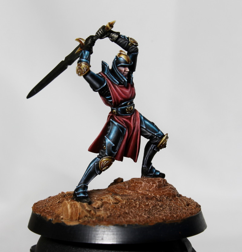
A key component of my approach miniature painting is shiny armour and it’s the aspect that I receive the most questions about, so in this post I’ll try to explain my technique as I continue to paint the Dark Sword commission.

A blog probably isn’t the best medium for this, but since I lack the capability to make video this will have to do! I’ve made the pictures as big as I can to help illustrate my technique but bear in mind that Dark Sword miniatures are fairly small.

Step 1: Basecoat (and a cheeky bit of cloth)

The most important thing is to keep it smooth! That means thinning the paint down enough so that you don’t introduce any brush marks. Generally speaking, larger areas need the paint to be thinned a little more than small parts. I only thin with water. Using a large brush is a good idea. With each coat I try to avoid having the brush strokes going in the same direction as the previous layer.

Recently I have started to use an airbrush for basecoating when I think it will be significantly quicker. I wouldn’t bother getting it out for anything smaller than a standard GW warhammer figure, and there needs to be large areas of the same colour for me to think it worthwhile.

step1_cloth

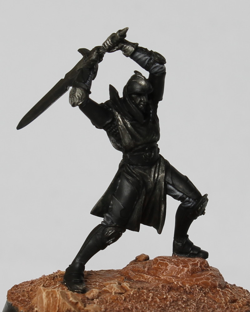
For this figure I had already primed with Vallejo black primer, so I just brushed abaddon black (GW) over the armour and the cloth underneath it. A couple of coats were sufficient in this case.

You can see that I’ve already painted the black cloth that sits under the armour. I highlighted with rosy flesh (reaper) with a little black added to desaturate and reduce the starkness. Then I highlighted with a mix of something like 1:1 rosy flesh and white, keeping this within the previous highlight. Finally I glazed back a little with thin black paint to smooth everything out. I’ll discuss glazing more when I get onto the armour though.

Theory

Before I get onto the technical details, a word on theory. I nearly always paint my miniatures as though they are being illuminated by 5 light sources. 4 of these imaginary light sources come from above the figure – this is a technique that I first saw in an old ‘Eavy Metal masterclass and is now handily explained in this excellent article on Darren Latham’s blog, so it saves me the effort of doing it! The advantage of this approach is that whatever angle you view the miniature from, you will see a reflection from at least 1 light source, and most likely 2.

What about the mysterious fifth light source though? This is a reflection from the ground, so it illuminates the underside of the figure. I like to include this partly to emphasize the glossy nature of the armour and partly because it gives me the opportunity to work another colour in if I want. I take some artistic licence with the placement of this highlight though. If you were to paint it directly underneath the figure then it wouldn’t be visible when the mini is viewed in normal conditions (we are nearly always looking down at miniatures). I therefore cheat and move the highlight upwards so that it becomes visible from a greater range of angles.

Before I apply any paint I usually spend a bit of time at this stage just holding the miniature at various angles under a lamp and observing where the reflections are strongest, as that informs where I’m going to place the highlights.

Step 2: First armour highlight

step2_armour1

At last I start to work on highlighting the armour! Looks awful at this stage, doesn’t it?

A few years ago my preferred technique was to build up highlights gradually with many thin layers, each having only a small step in brightness over the last. There’s nothing particularly wrong with this technique and there are some fantastic painters that use it. Personally I now find it a bit too time consuming and consequently my own technique has evolved away from this approach.

Instead I like to apply just a couple of highlights, with a big step in contrast between each layer. In the picture above you can see the result after I’ve applied the first highlight. For the 4 overhead light sources I’ve used a 1:1 mix of thunderhawk blue (GW) and ghost white (reaper), while for the ground reflection I’ve used rainy grey (reaper) with some white added.

At this stage I’m more interested in getting the contrast up than getting the colour saturation. The glazes I use to smooth the blends later will also allow me to introduce more colour.

The key thing when applying this paint is to try and smooth out the edges before it dries so that there’s no sharply defined boundary between the layer and the basecoat. The layer paint is used very thick – I will add just a little touch of water to help with flow. This is because I want to maintain the opacity of the paint. If I were to thin it more then I would need to apply the paint multiple times to get sufficient coverage.

I work on one segment of armour at a time. I put the layer paint down with quite a lot of the thick paint on my brush and then very quickly put the brush in water, dab it on kitchen towel so that it’s just damp, and then run it along the edges of the layer and the basecoat. This allows the paint to flow out from the layer and prevents the formation of a hard edge which would be difficult to disguise later.

Sometimes I’m not quite happy with the results, so it is possible to use the tip of the brush to move the paint around a little and improve the transition. But once the paint starts drying you have to leave it alone or you’ll end up with a rough surface texture and never get a good blend. Keeping the paint smooth is key.

It’s important to say that although this technique is quick, it is certainly not easy! I have experimented with variants of this approach but this way works well for me. Essentially it is two brush blending but rather than using a second damp brush, I re-use the first brush after a quick rinse. Two brush blending is fine but I found that constantly having to worry about whether the second brush was at the right level of dampness was slowing me down.

If the weather is hot then the paint will dry more quickly and things become more difficult. I try not to paint if it’s getting too warm but if I do then I will sometimes pre-wet the surface before putting the layer down. This can either be a very thinned down re-application of the basecoat or pure water. The surface should just be damp rather than flooded. This helps the layer to start flowing before the damp brush is used and buys a little time, but it is extra hassle.

Another option would be to use a bit of retarder in the layer to give more time before it dries. This is something I keep meaning to try but haven’t got around to yet!

Step 3: Second armour highlight

step3_armour2

After allowing the previous step to dry fully, I apply the second highlight. I’m getting close to pure white here. Typically I take white and add a small dab of the first highlight paint. I will be knocking the contrast back a bit with the glazing, so I’m deliberately over highlighting a little.

The technique here is exactly the same as in the previous step, but the area of the highlight is smaller. It can be helpful to use a smaller brush at this point. I think I probably used a size 2 for the previous step and a size 0 here.

Step 4: Glazing

step4_armour3

Now I have the contrast it’s time to add some colour! Here I have glazed the overhead highlights with a 1:1 mix of thunderhawk blue and sotek green (GW). For glazes I just add a lot of water to the paint. I realise that just saying “a lot” is really unhelpful. The problem is that there’s no set ratio – it depends on the thickness of the paint. It’s something you get more comfortable with eyeballing the more you practice.

If you’re unsure then it’s probably best to err on the side of a little bit too much water, since this just means you’ll have to apply more layers before you get a result you’re happy with. I think that over time I’ve moved towards slightly thicker glazes as I’ve become more practiced and less patient. We’re probably talking about something in the 2 parts water to 1 part paint range, but it definitely varies considerably.

When glazing it’s important to wick almost all the watery paint mix off the brush with kitchen towel or similar before applying it to the miniature, otherwise you’ll get ugly tide marks. Plenty of layers are needed to build up the intensity of the colour and mask the slightly rough transitions. I glaze over the entire highlight area that I’ve applied, but I focus more layers around the edges.

Once I’m happy with the colour intensity I glaze once or twice with the basecoat (black in this case) but only at the extreme edges of the highlighted area. This just neatens things up a little more, since there may be a visible boundary forming between the area that has been glazed with the midtone and the basecoat.

The next step would be to apply final small white highlights, but I elect to leave those until I’ve painted the gold areas, so that I can do both at the same time.

Step 5: Gold NMM

step6_gold2

The technique here is very similar to the black armour.

In the first image I’ve applied a basecoat of 1:1 heavy gold brown (VGC) and calthan brown (GW). Heavy gold brown is the best proxy for snakebite leather I’ve found so far. I love snakebite leather but sadly I’ve run out now!

I’ve then highlighted with a 1:1 mix of heavy gold brown and yellowed bone (reaper) and then pure yellowed bone. I’ve used the same highlighting technique as described for the black armour, but not been quite so fastidious about hiding the transitions with the damp brush since the areas are smaller and it will be easier to tidy up later.

step7_gold3

I’ve now shaded with dark flesh (GW). Basically I’m putting this anywhere that hasn’t been highlighted, but leaving a region of the basecoat visible. The paint is thinned down enough that it takes about 3 coats to get a fully opaque layer, and I apply it by brushing away from the highlight, so it builds up in the recesses.

step8_gold4

A further shade with a 1:1 mix of dark flesh and black. Here I’m working in a much smaller area and concentrating on the recesses.

Step 6: White highlights

step9_armour

Ta da! I apply the white paint fairly thick, but thinned down enough that it takes a couple of applications to make it fully opaque. You can see that I apply the white extremely sparingly.

I’ve also added a small amount of pure black into the deepest recesses on the gold areas. The gold areas aren’t completely finished here, as I intend to go back and work on them a little more later. They’re good enough for now though.

Conclusion

Kudos if you made it this far! I didn’t realise quite how long this post would be when I started it. I hope that it has been useful, and de-mystified my technique a bit. Please feel free to ask any questions in the comments and I’ll do my best to answer.

There will of course be a third (and possibly fourth) part to this article in due course, as we’re not finished with this miniature yet! The eagle-eyed will have noticed that I’ve done nothing with the ground reflections on the black armour after the initial highlight application. And there are plenty more areas that haven’t seen any paint at all yet.

Part 3 is here.