Gallery

Dante Re-Imagined

Tapping into the strong vein of nostalgia that runs through many of us hobbyists of a certain age, Games Workshop have been revisiting many of their classic 90s miniatures in recent years. This year it was the turn of the venerable Commander Dante to cross the rubicon primaris and be re-imagined in glorious plastic.

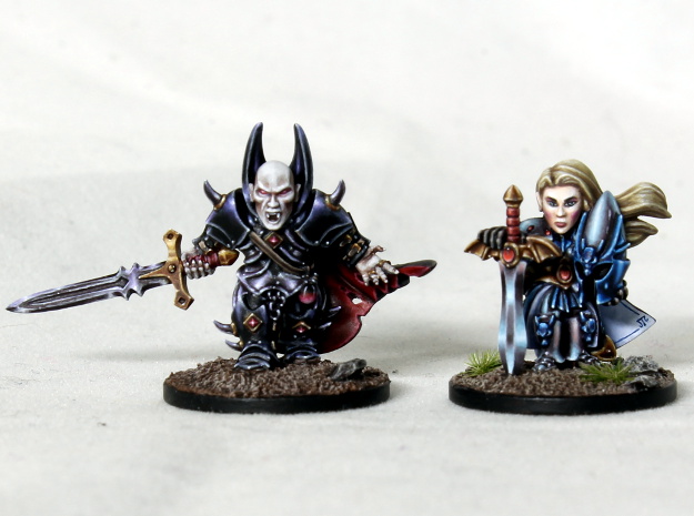
On the left here we have classic 90s Dante, sculpted by the incomparable Jes Goodwin, and on the right we have the 2023 incarnation (not to scale), designer unknown. I spent many hours as a teenager staring at the 90s miniature and it’s one of my all time favourites. It superbly captures that essence of the gold clad angelic commander leading the Blood Angels chapter into battle, as seen in the legendary Dave Gallagher artwork. Clearly it suffers a bit from the limitations of the casting technology at the time – most notably around the head where the halo in particular is rather more solid than could be wished. And by modern standards it is rather small, although personally I don’t have a problem with that, and rather regret the relentless embiggening of everything.

When I saw the new version I have to say that unfortunately I was initially a little disappointed. There are certainly some good features – I like this solution for the halo, and the addition of a loincloth and the extra flaps on the jump pack are improvements to my eye. The paint job is of course superb; I don’t know which of the ‘Eavy Metal team painted it but they certainly earned their pay that week!

Before going on to mention some of the areas that I’m not so keen on, I do want to emphasize the reality that the designer was working to a deadline (you would be expected to complete a miniature like this in a maximum of 4 weeks when I was in the studio, and bear in mind that that includes the time needed for concepting, sculpting, and engineering, plus losing a fair bit of time in various meetings) and so we shouldn’t expect miracles. There’s absolutely nothing wrong with the miniature, and I’m sure plenty of people have bought it and are very happy with it. The lengthy wait I had for it to come back into stock certainly suggests that was the case! My criticisms are of course down to a matter of personal taste.

With that caveat out of the way, the main issue I have with the new miniature is the pose. It’s probably just me being a bit dim but I can’t figure out what Dante is supposed to be doing on that bit of ruined masonry. Is he taking off or landing? Unfortunately the flow of the loincloth and purity seals mean that it doesn’t read like either to me, which leaves me with the awkward feeling that he’s actually just balancing there on his toes. I understand that the designer wanted to elevate him to emphasize the fact that he can fly, I just feel it’s a bit clumsy.

The other element I don’t particularly care for is the head. Although the halo and laurels are an improvement, the way that the death mask of Sanguinius has been grafted onto a standard mk 10 helmet seems a bit awkward, and I feel that the face itself has lost the character of the original. And personally I would have liked to have seen Dante get wings, like the Sanguinary guard. The original sculpt predates this kit by many years, but now that winged golden Blood Angels exist, it seems weird that the commander doesn’t get this embellishment. I expect that if the designer considered this aspect, then they may well have been limited by the constraints of frame space, but looking at how much space on the sprue is consumed by the terrain feature and the many pieces of the jump pack, I wonder if something could have been done.

Of course, it’s all too easy for me to sit here away from all the pressures of the studio, indulging myself in a spot of armchair sculpting. Time to get out the trusty Wacom tablet and get to it! I did consider a conversion but when I tried that with the warlock I ended up with something that didn’t exactly match my vision for the piece and wished I’d just sculpted it from scratch in the first place. The first thing I did here was create a very rough Dante T-pose and use it to try out a few different poses and compositions. I looked at having him on foot, but it really felt like he needed to be airborne, so I looked at different ways of making it look like he’s in the air without the necessary attachment to something solid being too obvious. I printed out a few scaled down versions so I could see how they would work in reality and eventually settled on the composition that you can see here.

The concept is that Dante is descending into the war torn ruins of some kind of suitably gothic building, while firing his inferno pistol at an unseen villain. The pose actually ended up quite similar to the latest GW version, although I found that I preferred more of a bend in the right leg and with the axe mortalis raised up, more like the 90s original. I used the right wing as the attachment point to the ruins and I think this solution works reasonably well, although it limited how thin I could make the wings as I needed it to give a sufficiently large contact point, and be solid enough to support the weight of the whole model.

To help sell the idea that Dante is descending, I retained the loincloth but had it folded up underneath him, and made use of some unfeasibly long purity seals flapping in the breeze. Are they too long? Possibly, but when I tried making them closer to a more standard length I felt that the composition was weaker, and I comforted myself that the Sanguinor has incredibly long pieces of parchment keeping him in the air, so it’s not entirely without precedent. The shape of the wings does not follow the template set down by the Sanguinary guard. I tried it, but the shape I ended up with felt more dynamic in this case (it’s similar to the plastic Blood Angels chaplain with jump pack).

The weapons are pretty much exact matches to the GW versions, as I was able to take measurements from the plastic once I finally got it in my hands. I did make an adjustment to the design of the axe, just to put the original mini skull power node back in and go back to just one node, as I think it looks better. The halo is also a copy of the new version, but for rest of the head I have tried to go back towards Jes’ original. For the jump pack I’ve switched out Dante’s classic twin thruster version for the design that comes with the Sanguinary guard. I did try and integrate the wings with the other type, but it just doesn’t work well. I made a few adjustments to the armour, but nothing massively significant except for reintroducing poleyns (knee armour). Again, just personal taste here.

I’ve never been much of a fan of making bases, so it obviously made sense to give myself the task of making a particularly large one for this miniature. Unfortunately it’s necessary to give Dante sufficient height, so I just had to grit my teeth and get on with it. My intention is that more texture and debris would be added to the base prior to painting – what you’re seeing in these images is just the stuff that gets printed. The base is a 50 mm diameter, so exactly the same footprint as the GW version!

So there you have it – my own version of Dante, chapter master of the Blood Angels. After a bit of trial and error I worked out the best way of splitting him up to enable easy printing and painting. Unfortunately I did end up needing to print that huge scenery piece a few times, and with a 0.03 mm layer height those were some loooong prints!

The question now is, am I ever going to paint him? Looking at the files on my computer reveals that it has already been 5 months since I last worked on this project, and so far I just haven’t been able to find the motivation to do it. After the trauma of sculpting it, I think maybe it’s the thought of painting the base that is preventing me from picking up the brush, although all that gold armour doesn’t appeal very much either! I have to admit that it seems a shame not to have a completed physical representation of the work though, so perhaps the thing to do is to paint a copy to something less than my best standard, as I did with Alarielle last year.

Finally, I realise I’m probably wasting my time here, but please don’t bother contacting me requesting the STLs. It’s not going to happen, sorry.

Gallery

Mk 7 Space Marine in Primaris Scale

When primaris space marines were revealed back in 2017, I really liked the new proportions and design but had mixed feelings about the move away from the classic mark 7 armour (and earlier marks) that I grew up with. It’s purely nostalgia I think – it doesn’t matter how amazing the new miniatures are, they just can’t recapture that golden era of my youth!

The problem is that once I’d had my eyes opened to the new space marine proportions, it was difficult to look at the classic marines and not see their underdeveloped legs and lack of abdomen! So sometime last year I thought it would be a fun little project to make a mark 7 tactical marine in primaris scale.

The miniature you see here was made from scratch in blender, using measurements I took from a primaris marine to get the proportions right. I thought it would be fun to add a few blood angel specific bits of bling and I tried out some swirly embellishments on the pauldrons, but I think the mini actually would have been better without these. I printed it on my Elegoo Mars 3, using standard Elegoo resin.

I kept the paint job nice and simple since I didn’t want to get bogged down spending a long time on what was just supposed to be a bit of fun. Just an ‘Eavy Metal style but trying to bring some of that second edition blood angels flavour in with the black rims on the pauldrons and the bright yellow chest eagle! I suppose I should have gone all in with a goblin green base really. Maybe next time!

For those that want to know my recipe for the red armour, it’s as follows:

Basecoat 1:1 mephiston red and evil sunz scarlet over a very pale flesh coloured primer (white would be fine, it’s all about getting a really vibrant red).

Shade with khorne red, then a khorne and incubi mix and finally black in the deepest recesses.

Edge highlight with evil sunz scarlet, wild rider red, fire dragon bright and small spots of lugganath orange.

Gallery

Fuegan part 2: painting

Part 1 of this project is here (if you’d like to read me waffling on about the 90s and how amazing Jes Goodwin is). There didn’t seem much point in producing a painting guide for this miniature since no one else will be painting it, so I didn’t take any work in progress photos but I have made more of an effort than usual to explain my approach and the colours I used. It’s a lot of information but hopefully a few people will find it useful.

After a few test prints of Fuegan on my Elegoo Mars, I was fortunate enough to be able to get a really high quality print on a much more expensive machine from a friend. Although the budget resin printers are getting really good these days, there is still a noticeable difference in the sharpness and dimensional accuracy that a £10k machine can achieve vs a £200 machine (as there should be)!

The test prints afforded me a great opportunity to test out colour schemes before committing to the top quality print. I looked first at the current ‘Eavy Metal miniature, and although I really liked the moody, brooding atmosphere that the dark helmet evokes, I was concerned that if I did something similar on my miniature I risked losing focus on the head, as I knew there would be bright elements elsewhere.

I knew that I would definitely be using suitably fiery colours ranging from deep red through to yellow for the armour, so the main things I needed to resolve were the complimentary colours I would use and what to do with the helmet.

Inspired by some vivid sunsets, I was attracted to the idea of using magenta and violet for the scales, gems and cape. The test looked good, and I liked the tie-in with the narrative (since the eldar are in the sunset of their days). I very nearly went this way but ultimately I went with the less adventurous green because I felt it gave more pop as a spot colour.

I tried a few different options for the helmet, including having the helmet itself dark and the face plate light, and painting the whole of the helmet in yellow for maximum brightness. Although I didn’t particularly like either of these, I did discover that using pure yellow on the miniature just wasn’t working for me so in the end I didn’t go more yellow than a 1:1 mix of trollslayer orange and yriel yellow. I used this colour around the face plate to really draw the viewer’s eye and then faded through to gal vorbak red. The wings on either side faded in the opposite direction, and I found that I liked the ambiguity between light reflection and flames in the highlights I painted towards the bottom of these.

I considered using metallic paint on the miniature for metal elements, but I decided against it because I thought I would be able to achieve a better looking result on the axe head with the glowing rune if I went with non metallic metal. If I had only to consider the copper elements I probably would have gone with true metallic because I love the way it looks in the hand but as it was I had to work out a recipe for copper nmm, as I couldn’t remember how I’d approached it before!

It had been quite some time since I had attempted to paint to my highest standard and discovered that it took a little while to feel comfortable with my techniques again. I do sometimes feel that my painting is being left behind by the incredible advances in the wider community but sculpting has to be my focus at the moment and sadly that means that I don’t have as much time to devote to trying to improve my painting game! I ended up painting this miniature very gradually over the course of a few months in my spare time.

Because I had already done my colour tests I was able to paint the miniature in sub assemblies with confidence that it would work when put together. In practice this just meant painting the cloak, banner and head separately, and also the barrel of the pike because it’s so long I knew I’d keep snapping it off if I attached it too soon! I hadn’t decided on the colour of the base (or even finished sculpting it) when I started painting the miniature in order to continue my long held tradition of leaving it as an afterthought. 😉

Armour

I began the painting with the armour since it is the bulk of the miniature. I started with a base coat of 1:1 mephiston red and evil sunz scarlet that I painted directly onto the resin (after fully curing it and washing it with warm soapy water of course). It’s amazing how well paint goes onto the resin that you get from 3D printers (or at least the resins I’ve encountered), and I was pleased not to need to break out the airbrush for a smooth base coat, which always feels like a hassle.

Those who have purchased one of my painting guides will be familiar with the techniques I like to use to achieve the area highlights and I used the same approach here. I worked up through highlights of wildrider red, firedragon bright, lugganath orange and then added to white to this. Shading was with gal vorbak red and I then added some black to this.

I smoothed the transitions with very focused glazes made from all of the colours I had used plus pure evil sunz, but I felt that the armour still lacked a little punch so I glazed incubi darkness into the shadows and added very thin glazes of 1:1 trollslayer orange and yriel yellow over the highlights. The smaller reflection highlights on the armour were added after I’d painted the rest of the miniature. I just placed these anywhere I thought the miniature could benefit from them – there was certainly no science behind it! The incubi darkness ended up being a unifying colour that I used across several elements of the miniature (including the base).

I painted the undersuit of the armour using the same colours but didn’t apply the yellowish glaze, just to provide a subtle little difference between the two areas.

Helmet

For the helmet I started with a base coat of bone, again painted on with a large brush onto the bare resin. This enabled me to get the brightest colours possible when I painted over the top of it, and the helmet was going to be all about bright colours!

Over the base coat I started with my 1:1 mix of trollslayer and yriel yellow in the areas that would end up this colour and extending out until about half the area of the helmet and wings were covered. I then switched to pure trollslayer orange and painted layers with the brush strokes starting in the yellow and moving away into the area that was still bone. I thinned the paint so that I was able to gradually build up a smooth transition (although a certain amount of remedial glazing was still needed later). This process was then repeated with evil sunz scarlet (starting in the orange) and gal vorbak red (starting in the evil sunz), finally adding some black to the gal vorbak for the deep recess shading. I then used the incubi darkness glaze into the shadows.

With the colour transitions done I then moved on to highlighting the helmet. I used the same colours as I had used on the armour for this and I applied edge highlights at the same time as the flame-like larger highlights towards the bottom of the wings. Towards the top of the helmet I didn’t use oranges in the edge highlights and just added white into the colours I had used.

Black elements

The armour trim, the pike and the handle of the axe were all painted in the same way. I began with a black base coat and then highlighted with eshin grey, dawnstone, and administratum grey before adding a little white to this last colour. I made the highlights on the upper edges brighter than those below and I found that quite a bit of glazing was necessary to tidy up some of the highlights, particularly the very long thin ones on the pike. Fairly late on I glazed a little incubi darkness over the highlights on these elements and re-established the brightest dots to make these elements colder and contrast more strongly against the armour.

The other black elements are the trim around the tabard and the strap across Fuegan’s chest. I wanted these to be warmer and didn’t want to bust out more paints, so I ended up mixing lugganath orange and vmc sunny skintone into the black and then adding a little white. I think it looks ok but I discovered that lugganath orange really doesn’t play nicely with black and it took some pains to get the transitions smooth.

Cape

The outside of the cape was base coated with a mix of incubi darkness and black and I highlighted this with incubi darkness and then added sunny skintone. After applying some fairly rough highlights I switched to stippling in order to add some interesting texture (I have covered this approach in more detail in the aforementioned painting guides). I also painted a few fine little scratches here and there, since I imagine that whatever beastie it was taken from probably had quite a hard life.

The scales on the cape were painted in the same way as those on the tabard and the side of the helmet. A base coat of caliban green was highlighted with warpstone green and then sunny skintone was added to the warpstone green. Shading was with black and a little incubi darkness.

I wanted a warm tone for the inside of the cape so started with a basecoat of rakarth flesh and shaded this by mixing in skavenblight dinge. I highlighted with vmc deck tan and again employed stippling to add texture. In this case I picked out a few areas and made them a little darker to try and make the surface feel less uniform and artificial. With this process complete I felt the inside of the cloak still looked a little lifeless so I glazed a little incubi darkness over the darker areas and stippled a tiny amount of sunny skintone into the highlights.

Banner

The banner was base coated with gal vorbak red and then highlighted with the same range of colours I had used on the armour. I practiced the freehand design on one of my test prints and then took a deep breath and dived in! I used leather white (from reaper) as my weapon of choice to get a smooth white for the strip along the bottom, the circle around the dragon and the fire dragon rune with a fair amount of winsor & newton acrylic flow improver added. The key is always to start with a heavily diluted paint and sketch in the design before gradually refining with slightly thicker paint until you get something that looks half way decent.

For the eldar runes along the bottom I added some winsor & newton black ink to black paint. I have experimented with using pure black ink for this type of thing but I don’t really get on with it – it seems too easy to remove it from the surface and I don’t seem to get quite the same sharp finish. I added just enough black ink to make the paint flow nicely with some water in the mix. To be honest I probably could have just used the flow improver – all that matters is that the paint comes off the brush easily. I used a size 1 brush for all the freehand work. Actually I used size 1 brushes for pretty much the entire paint job, but I reserved the ones with good points for this kind of work.

I wanted to the banner to feature a dragon breathing fire so that when viewed from the front, the flame colour combined with the glow on the two weapons forms a triangle around the helmet. I used the same colours for the dragon and the flame that I used elsewhere on the miniature.

Non metallic metal recipes

For the copper areas I base coated with doombull brown and highlighted with mournfang brown and deathclaw brown. Shading was with rhinox hide and then black. I added white to deathclaw brown for the extreme highlights and applied some thin glazes of the same 1:1 trollslayer orange and yriel yellow mix that I used on the armour before re-establishing the extreme highlights with white.

For the axe head I base coated with mechanicus standard grey and highlighted with administratum grey and white. I shaded with a mix of gal vorbak and black rather than pure black to add a little visual interest. I glazed some of the highlights with the orange/yellow mix and some with incubi darkness, particularly those on the underside since by this stage I knew that the base would also be using this colour.

Glowing effect and gems

For the fiery glow on both the axe and the pike I first applied pure white directly into the recesses to maximise the brightness of the subsequent layers. I then built up the glow working from the outside in, starting with gal vorbak red, then evil sunz scarlet, trollslayer orange and then adding yriel yellow. The paint was thin enough that it took several applications to build up the full opacity so that smooth transitions could be created. I reapplied white more sparingly into the deepest recesses and tidied up the glow anywhere it needed it with focused glazes.

For the gems I started with black and painted most of the area with caliban green, leaving a small area of black towards the top. I then highlighted the bottom of the gems and around the edges with warpstone glow and then moot green within this area. I added white to the moot green for the extreme highlights and pure white reflection spots of course.

Base

For the base I used a mix of incubi darkness and little black and then built up quite a rough stippled texture with incubi darkness and then with administratum grey added to the incubi darkness (to differentiate it from the back of the cloak which used warmer highlights). The inlaid runes around the edge and on the top had a little moot green added in to dawnstone and then these were stippled and edge highlighted with administratum grey and white.

And with that, the project was done! To finish, here’s a few close ups:

Gallery

Fuegan part 1: sculpting

First up – I’m sure most people won’t bother to read the lengthy waffle below, so I’ll put this right at the top in the hope that it deflects a few questions: please don’t bother asking me for the STLs of my Fuegan sculpt. It’s Games Workshop IP and I won’t be distributing it, sorry.

Background

The eldar were featured in the very first white dwarf that I owned (issue 138, June 1991) and they made a huge impression on my young mind. The sublime elliptical curves and the riot of bright colours across the various aspects epitomised the aesthetic that has appealed to me ever since.

White Dwarf 138 back cover: eldar and blood angels. Clearly this had no influence on me at all…

In second edition warhammer 40k I owned a very small amount of eldar alongside my slightly larger blood angels force. I don’t recall exactly what miniatures I had but there was definitely a squad of fire dragons with exarch. The phoenix lords were added to the game around this time and I have painful memories of the original Jain Zar – a massively top heavy chunk of metal connected to her base by only the point of the toes on one foot! For some reason I never got hold of Fuegan, the phoenix lord of the fire dragon aspect but I always admired the miniature.

Back then I didn’t give much thought to how these miniatures were designed and I had no idea that one towering colossus of the citadel miniatures studio was responsible for so much of what I loved. I speak of course of the mighty Jes Goodwin, who among other things was responsible for creating the entirety of the eldar range! During my all too brief period working as a citadel miniatures designer I was fortunate enough to work alongside Jes for a short while and it only increased my sense of awe for his work.

It’s a testament to Jes that most of the original phoenix lord miniatures, released in the early 90s are still for sale in 2021, more than 25 years later! I doubt that many of the miniatures sculpted today will prove to have such longevity. Jain Zar has now been replaced with a superb plastic version sculpted by Neil Langdown in collaboration with Jes, but there’s no telling how long we will have to wait for the other lords to receive this treatment. After all, we wouldn’t want to slow the production of variant number 14,538 of primaris space marines in order to update a few filthy xenos now, would we? 😉

Some time in mid 2020 I decided I wanted to paint Fuegan, so I took a good long look at the miniature on the GW store and I just couldn’t bring myself to click buy. It’s not clear whether the current incarnation is metal or finecast, but I’m not a fan of either material. And undoubted classic though it is, that dude is old and you can clearly see the limitations of the casting technology of the time in how it has been designed. I’m guessing he’s probably quite small by today’s standards too.

Original Fuegan, complete with 25 mm round base!

Unfortunately, while Fuegan may be immortal, I am not. So if I was going to get to paint him before completely succumbing to the ravages of age waiting for a plastic version it seemed to me that I’d better think about sculpting my own. And so, armed with a copy of Jes’ eldar sketchbook and various google images like the one above I embarked on my latest project.

Sculpting

I started sculpting Fuegan by constructing a dolly so that I could get the size and proportions right before I started thinking about the pose and the details. I based this on current eldar miniatures but then made him a little larger, as befits his status (he ended up measuring approx 35 mm to the eyes). At this stage I was working with low poly, just getting the main forms sketched out. As always I used blender for my sculpting, together with my trusty old Wacom Intuos small tablet.

When I had something that felt about right I started thinking about the pose. I knew I wanted to retain the classic huge pike and axe and I found that the pike limited the options for posing. (Or maybe I just wasn’t imaginative enough!) It really only looks good in an upright position and it has a tendency to interfere with both the left shoulder pad, upper arm and thigh. I was focusing on trying to get a strong composition for the miniature when viewed from the front and after some experimentation I ended up with a pose that is reminiscent of Prince Yriel and very similar to a 90s sketch of a ‘fire dragon exarch’ in Jes’ book.

I made the decision to add the cape and the banner quite early on. The original miniature doesn’t have these elements of course, but I thought they were befitting of Fuegan’s status and would provide me with some area for a little freehand painting. Although I didn’t settle on the final form of the base until after I’d started painting the miniature, I knew that I wanted the large curved element on the right for the composition.

With the pose set I gradually worked my way around the miniature defining the details. The axe was one of the first elements I worked on – I kept a similar shape to the original but also looked at the version in the sketchbook to make some modifications. I decided to put a recessed rune into the blade with the intention of painting it with a glowing flame effect and at this point I ran into a little conundrum – the paint job on the old miniature and Jes’ sketches feature a rune with a curvy tail but the modern fire dragon rune is straight lines. In the end I decided to retain both on my miniature. I decided the curvy version could be Fuegan’s personal rune, but he also bears the rune of the fire dragon aspect that he established.

I kept the helmet very close to the original but added some more curvature to the big wings to make them a little less flat, and made some changes to the face plate just because the original isn’t completely to my taste. I kept the armour design more or less the same, but changed the greaves to be something closer to the modern designs. I’ve been working on a lot of small scale stuff recently and I really enjoyed the opportunity to lavish attention on some lovely large curved surfaces (yes, I really am that strange)!

One of the details I ended up spending a surprising amount of time on was the little dragon head clasp that sits on the right of his chest. I wanted to make that element more understated than the original but I really struggled to find a shape that simultaneously conveyed fierce dragon and eldar, and fitted neatly in the available space! I’m still not happy I really got this right but in the end I had to just accept what I had and move on.

I didn’t make big changes to the pike weapon, although I did redesign the stock to feature the curvy tail of what I had decided is Fuegan’s personal rune. I wanted to keep the concept that his left vambrace is connected to the weapon, but I changed the way this is integrated. After looking at all my sources, I wasn’t sure if the element that sits below the main barrel is intended to project a secondary blast but I decided it made more sense to have this as a power node for the weapon and would provide me with another opportunity to paint some glowing effect on the other side of the miniature for balance. I did strip out many of the power cables that original miniature has all over it. While I certainly appreciate the elegant s-shape that they create when viewed from the rear, I just felt that there were too many to read as a sleek eldar design so I only kept one of the main ones for the pike.

Originally I had intended to leave the cape with the classic sleek eldar look, but with the rest of the miniature sculpted I thought that it would benefit from being more organic. In the sketchbook, Jes makes a note that the 90s exarch should have ‘craggier’ detailing and I felt this was an opportunity to capture a little more of that intent. The design I ended up with borrows heavily from Steve Buddle’s superb Adrax Agatone salamanders space marine.

As previously mentioned, the base was sculpted a while after the rest of the miniature, mostly because as usual I lacked good inspiration for what it should look like! I considered various designs for steps but in the end went for something similar to one of the elements on the webway gate kit and then went to town carving eldar runes and craftworld symbols into it. And obviously it’s broken, because 40k.

One of the joys of sculpting for 3D printing rather than injection moulding is that I no longer have to spend hours worrying about how to split a miniature up, whether it will fit on the frame and a myriad other engineering concerns. But I still elected to split this miniature into a few pieces purely to make painting easier. And with that, it was off to the printer!

Overall it was a slightly odd experience working on this sculpt. I was trying to use my experience of working in the studio to anticipate what I thought Jes would do if he were making Fuegan today, while simultaneously trying to satisfy my own artistic taste. It was also a little weird not being able to ask any of my ex-colleagues for feedback. I’ve always been very happy working in isolation but I did find giving and receiving feedback one of the most valuable aspects of working in the studio and it’s definitely something I miss! If the great man himself ever sees this fan art, all I can hope is that he won’t find it too much of an insult to his vision.

Gallery

Xandria Azurebolt

The very first miniature that I made for Games Workshop as a trainee has now been released, so I can finally talk about it!

azurebolt2

Xandria Azurebolt (as someone in publications has elected to name her) is the exclusive knight incantor model that comes with issue 5 of the Mortal Realms magazine for Age of Sigmar.

I’d been at GW for less than a month when I was given the brief to make this miniature. After becoming familiar with the team and the software, all the trainee miniature designers are given 3 or 4 training projects. These projects are not in the release schedule so you’re not under time pressure and although you’re told that it would be nice if you produced something that could be released, it’s not expected at this stage.

azurebolt4

This then was my first training project in the summer of 2018. To be honest I’ve never been massively excited by Stormcast Eternals but I was given a really cool mock up that Steve Party had made and let loose to try and turn it into a product. The main areas of design work were the stave and the head. I remember going through quite a few iterations of the face until I got something I was reasonably satisfied with.

I was sitting at the desk next to the mighty Darren Latham when I worked on this, and he gave me a lot of help figuring out the engineering side, which was much appreciated. I think it’s fair to say that anything good about the final miniature is down to Steve and Daz, and anything not so good is down to yours truly! But I was pleased when the design managers told me that it would be getting produced.

azurebolt3azurebolt1azurebolt5

I decided to paint this in non metallic metal, which was a decision I soon came to regret, because as usual it took me far longer than I wanted it to! I don’t think the finish is as good as it could be in a few places but I didn’t think it was worth investing any more time to try and make it better. There are far more interesting miniatures that I’d like to paint!

closeups

Gallery

Dark Elf Dragon Queen

A sculpt I’ve been playing with recently is this dark elf lady, which I shared with Vince Venturella towards the end of the interview I did with him on YouTube recently. It’s designed at warhammer scale.

dragon queen wipdragon queen wip2dragon queen wip3

One of my main focuses with this piece was to get a satisfying composition. I also spent quite a while on the armour, trying to get the right amount of detail and make it suitably elfy looking. She’s supposed to have a menacing smile, although I’m not sure how successful this will be.

I haven’t invested in a 3D printer yet but it’s high up the priority list for 2020. I’ve got this one and the high elf split up into pieces that should be reasonably easy to print, so I hope I’ll be able to hit the ground running on that front!

Gallery

High Elf Dragon Maiden (again)

Fans of this blog may remember my first 30 mm sculpt, the Dragon Maiden. I’m pleased to say that RN Estudio are now selling resin copies of this miniature here. (In case anyone is wondering, I’m not making any money from this myself.)

Of course, it was only fitting that I give her a snazzy new paint job to celebrate this development! I’ve gone for non metallic metal again just because it looks better in photographs and I knew a good picture would be needed for the store.

Unfortunately there’s no painting tutorial for this piece but it uses the same recipes as the fantasy football high elf I painted recently, so that guide is highly recommended for anyone wishing to emulate my version!

dragonmaiden1_instadragonmaiden2_insta

Before producing the miniature, Rafael asked me to create an alternative right hand, which I was very happy to do. I also took the opportunity to fix her eyes, which were far too bulbous on the original. Her face is still not the right shape and I have had to disguise this with my paint work. I’ve corrected this deficiency on my more recent sculpts though!

dragonmaiden4_insta


Gallery

High Elf Star Player

helf_starplayer3

My first completed miniature of 2018 is another of my own sculpts. Actually this one was sculpted quite a long time ago (well before Drazhar) and was the first miniature where I discovered how to use rigging in blender.

sculpt

The delay in presenting the finished miniature was because my friends at RN Estudio are putting this piece into production (which is very exciting for me!), so you can now buy resin copies from them if you wish.

I’ve gone for non metallic metal again when painting this piece and stuck with the classic high elf colours. My technique is still evolving gradually and I’m fairly satisfied with how it has turned out here.

I’ve made another painting guide where I’ve tried to take on board some of the fantastic feedback I’ve had following the first three. I think this is the most in depth guide to my approach to painting nmm so far and I hope it will be useful to people even if they have no interest in this particular miniature! I’m aware that there is some repetition between the guides and this is something I’m going to have to think about a bit more.

The miniature bundled with the painting guide is here, or you can buy the miniature with no guide here. Or if you just want the painting guide I’ve also put it up on my Etsy store.

helf_starplayer3helf_starplayer2helf_starplayer4helf_starplayer5helf_starplayer6

Gallery

Bunny!

A slightly different type of miniature today as I present my first experiment with full colour 3d printing!

miffy1miffy2miffy3

My wife is a huge fan of a certain well known bunny rabbit so I thought this would be a great opportunity to make her a little gift.

I created a bunny model and coloured it in using blender, then uploaded the file to Shapeways. Definitely a different kind of painting to what I’m used to!

The full colour sandstone material that Shapeways offer is a bit rougher than the material I usually get my miniatures printed in, and there are more limitations over the type of model that can be successfully produced. It’s fascinating technology though, and it’ll be interesting to see how it evolves.

If you want a bunny of your own then you can purchase one from Shapeways here. 🙂

Gallery

Vampire Lord and Dragon Maiden in 15 mm

IMG_1964

It has been a while since I completed any 15 mm sculpts so I’ve been really keen to get back to it. I enjoy the sculpting, but the best thing for me is that I can paint each miniature in a relatively short time before the inevitable boredom sets in and other projects start to look more alluring!

I decided to exploit one of the advantages of digital sculpting and modify my existing 30 mm files to make shiny new 15 mm figures. This kind of thing appeals greatly to a lazy git like me!

(It should be noted that the process is a bit more involved than simply hitting scale 0.5 in blender, since this would result in details that would be too small to print successfully and would be out of proportion with the rest of my 15 mm range.)

IMG_1958IMG_1959IMG_1960

The original dragon maiden is here. I’ve made some improvements to the face for this version, and I went with a different colour scheme.

IMG_1976IMG_1977IMG_1978IMG_1979

I also went with a different colour scheme for the Vampire Lord. This guy is pretty big for a 15 mm figure – he’s actually more like 16.5 mm to the eye. I’ve made some changes to the face vs the 30 mm version after I realised that I hadn’t exaggerated some of the features enough.

You can buy these two miniatures as a set on Shapeways. The price (as ever) is higher than I’d like. Unfortunately these two miniatures use more resin than my average 15 mm which makes them more expensive under Shapeways’ pricing formula.